Being able to talk to computers using natural language, especially with the recent advancements in general AI models like ChatGPT, has become very popular in the last few months. Everyone is doing it. It's simple, easy to use, and frankly, it can be very useful. What has been around for a while—think Siri, Alexa, or TV remote controllers—has now been taken to a new level and is already widely used in business.
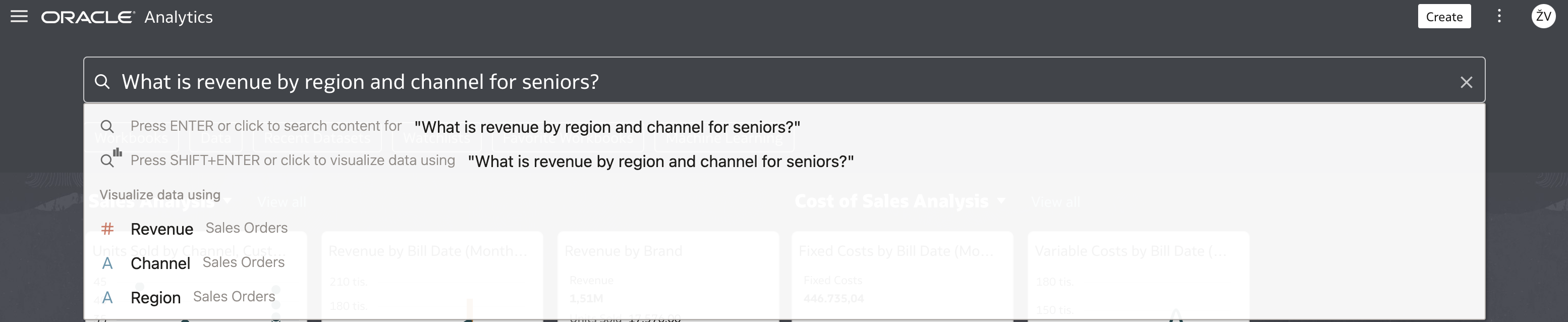
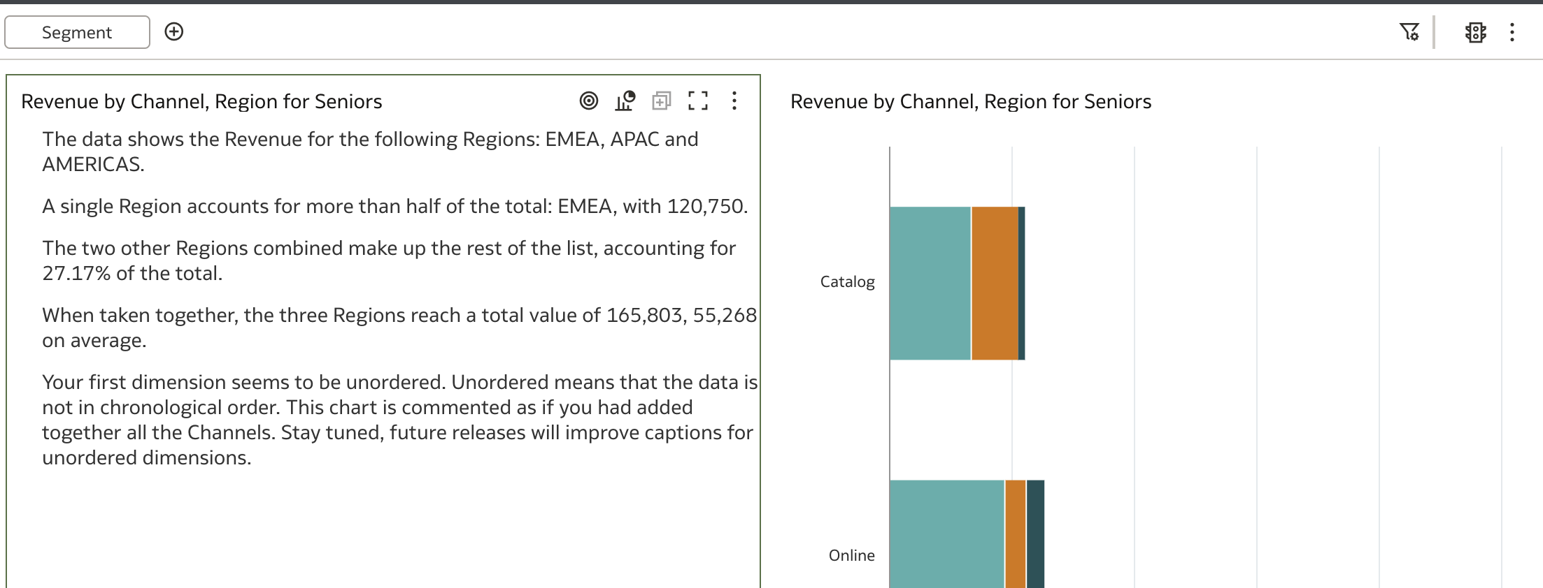
In Oracle Analytics, Natural Language Recognition has been available for several years. I remember the early days when the Oracle Day by Day mobile application was introduced. One of the coolest features in Day by Day was the ability to ask questions using natural language. For example, What is revenue by region and channel for seniors? would provide an answer in the form of charts, tables, and more. This feature is still available today, and you can ask such questions in the Search field located on the Oracle Analytics home page.
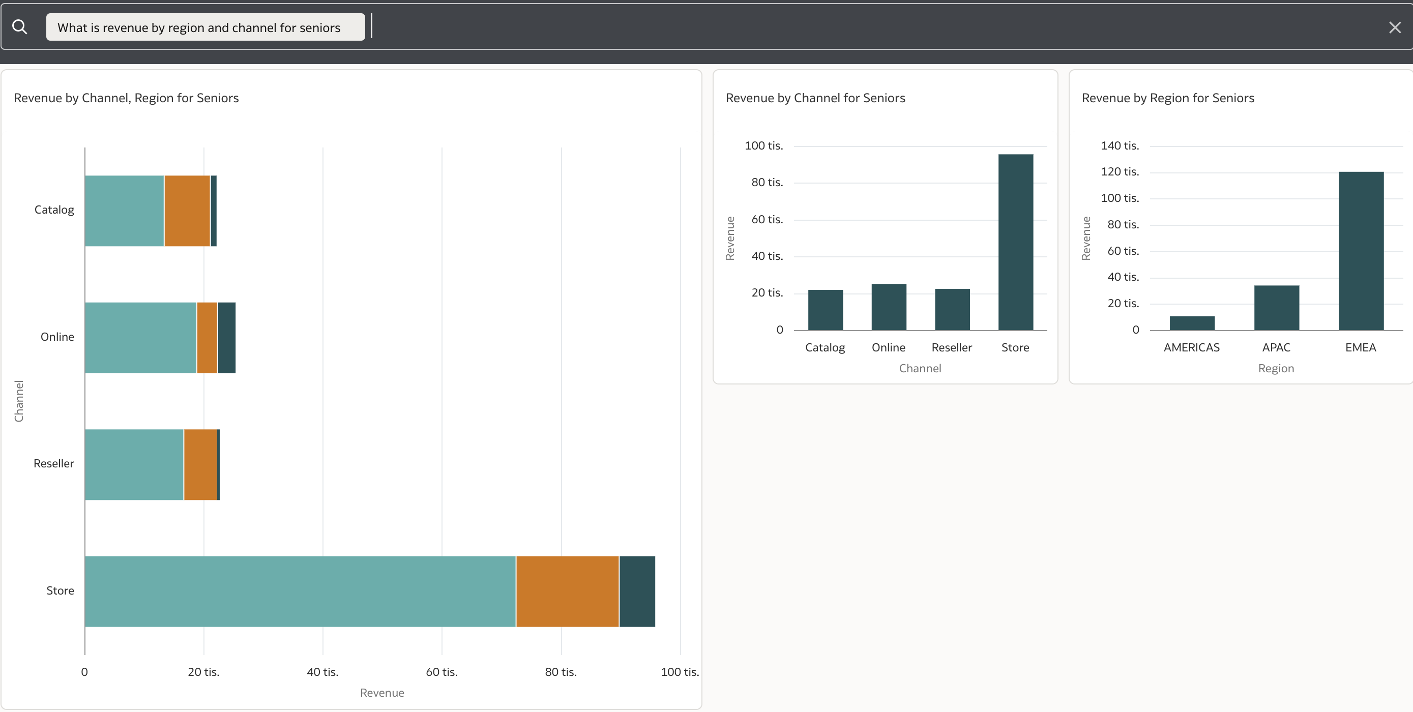
Oracle Analytics then provides the following answer:
Further navigation takes the user to more details in a newly generated workbook that can be further enhanced and customized by the user.
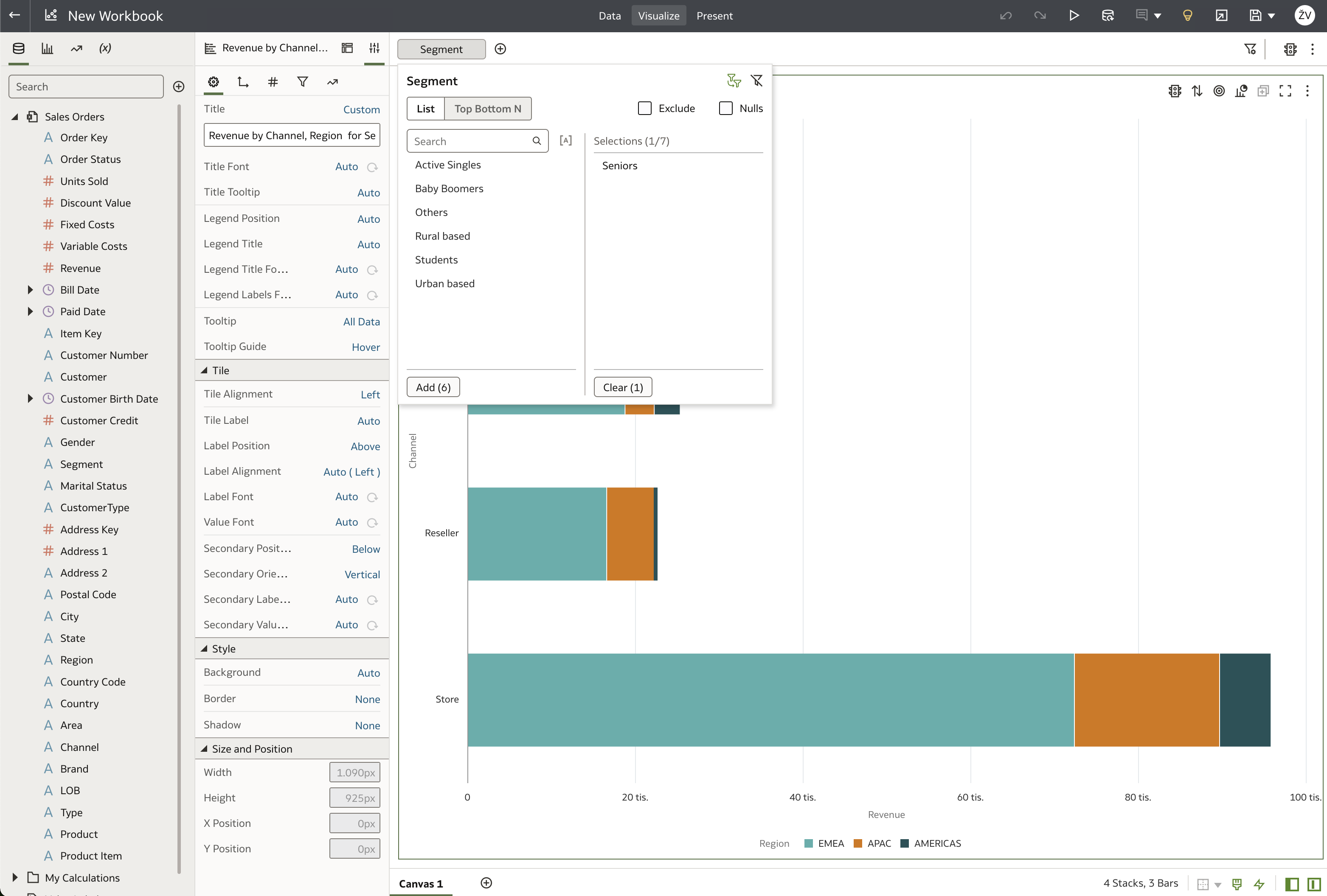
A quick note about the workbook above: Oracle Analytics recognized revenue as a measure, and channel and region as dimensions based on its index. The phrase for seniors in the question resulted in a filter being applied where Segment is equal to "Seniors".
This response is not yet based on advanced AI technology (though it may well be in the future), but rather uses simple parsing and search indexing to formulate the answer. So, while it is not at the level of ChatGPT or similar models, it is still useful for end users—especially in mobile applications like Oracle Analytics Mobile, where speaking is easier than typing.
If we now explore the example above and look into Natural Language Generation capabilities, we see that these are available in several places. For instance, the Explain function can generate detailed textual descriptions, and the Insights feature also provides rich explanations. Beyond these, Oracle Analytics offers an out-of-the-box Language Narrative visualization.
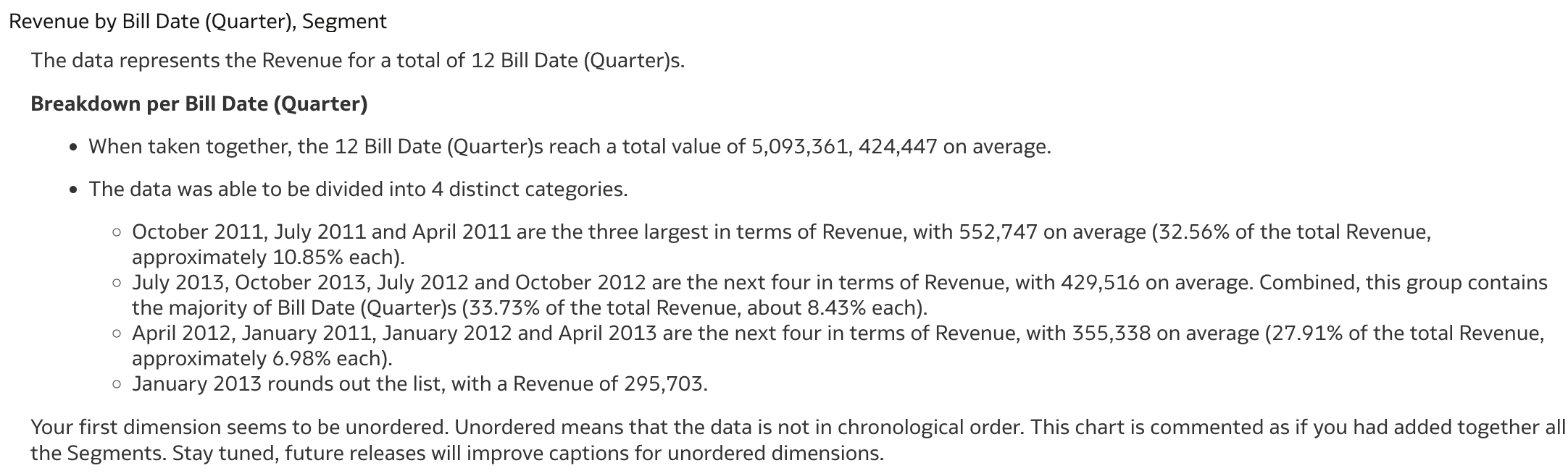
For example, if I change the visualization type from Horizontal Stacked to Language Narrative, ...
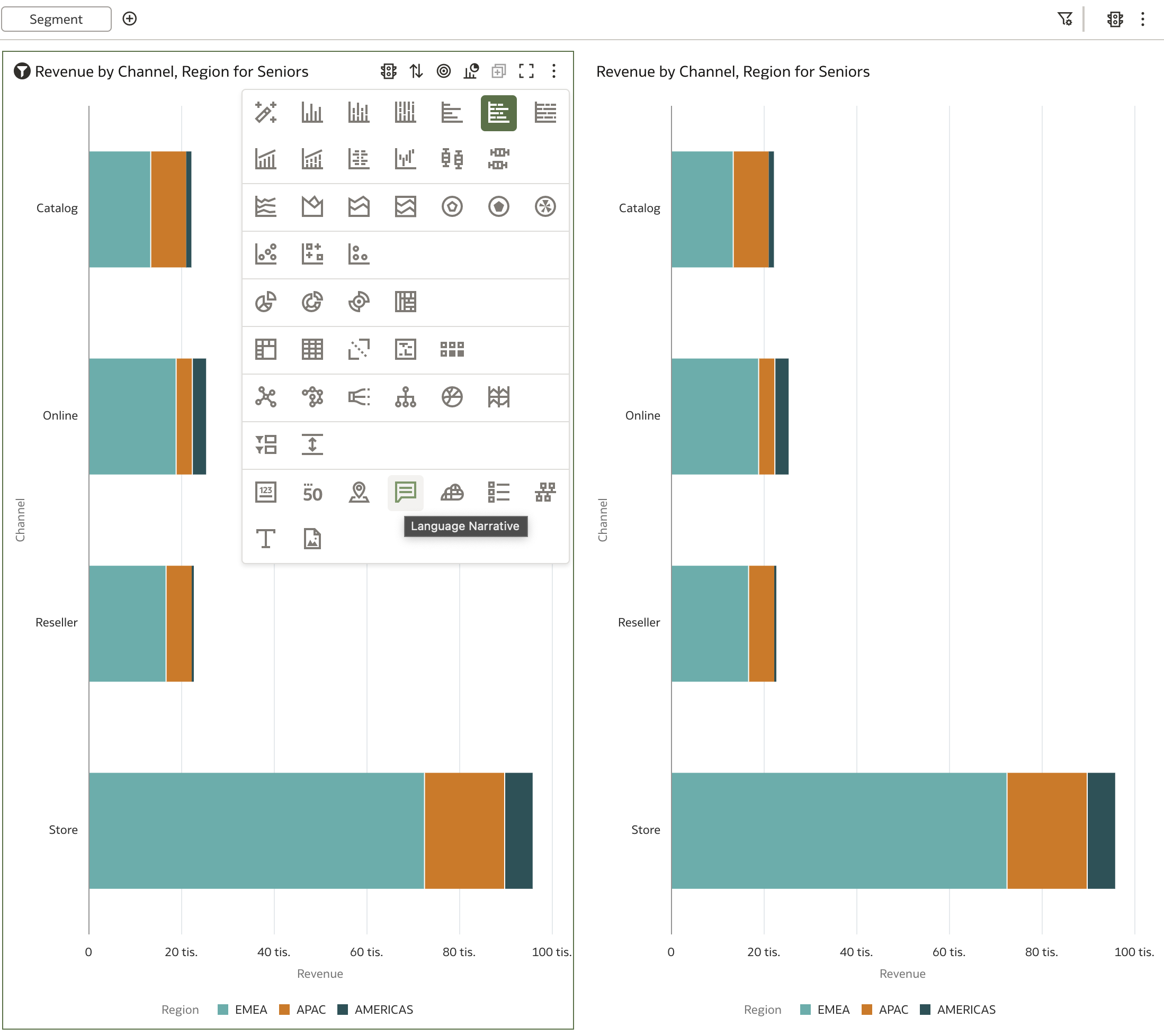
... the result looks like this:
So, how does this visualization work? As you might have noticed, the example above is not a state-of-the-art explanation of the chart on the right. There are certain ground rules for text generation, and of course, not everything can be expressed as text. Let's explore the options available!
First, the query in the example contains two dimensions and one measure, with an additional dimension in the filter. It was able to generate "something," but the result was not very effective. Working with Language Narrative has some limitations, one of which is how many attributes can be used in a query. Currently, the following combinations are supported:
- One measure with two dimensional attributes
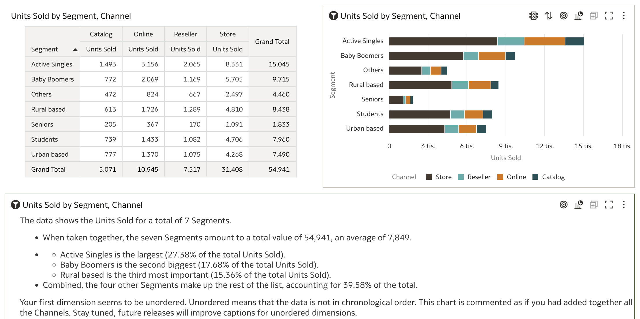
- Two measures with one dimensional attribute
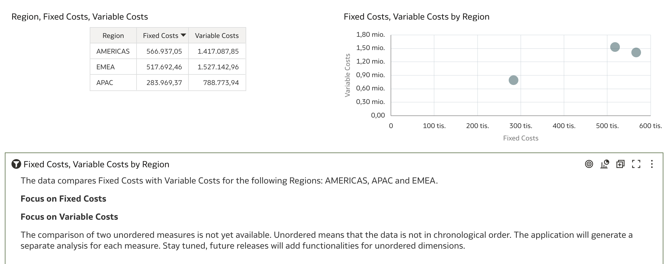
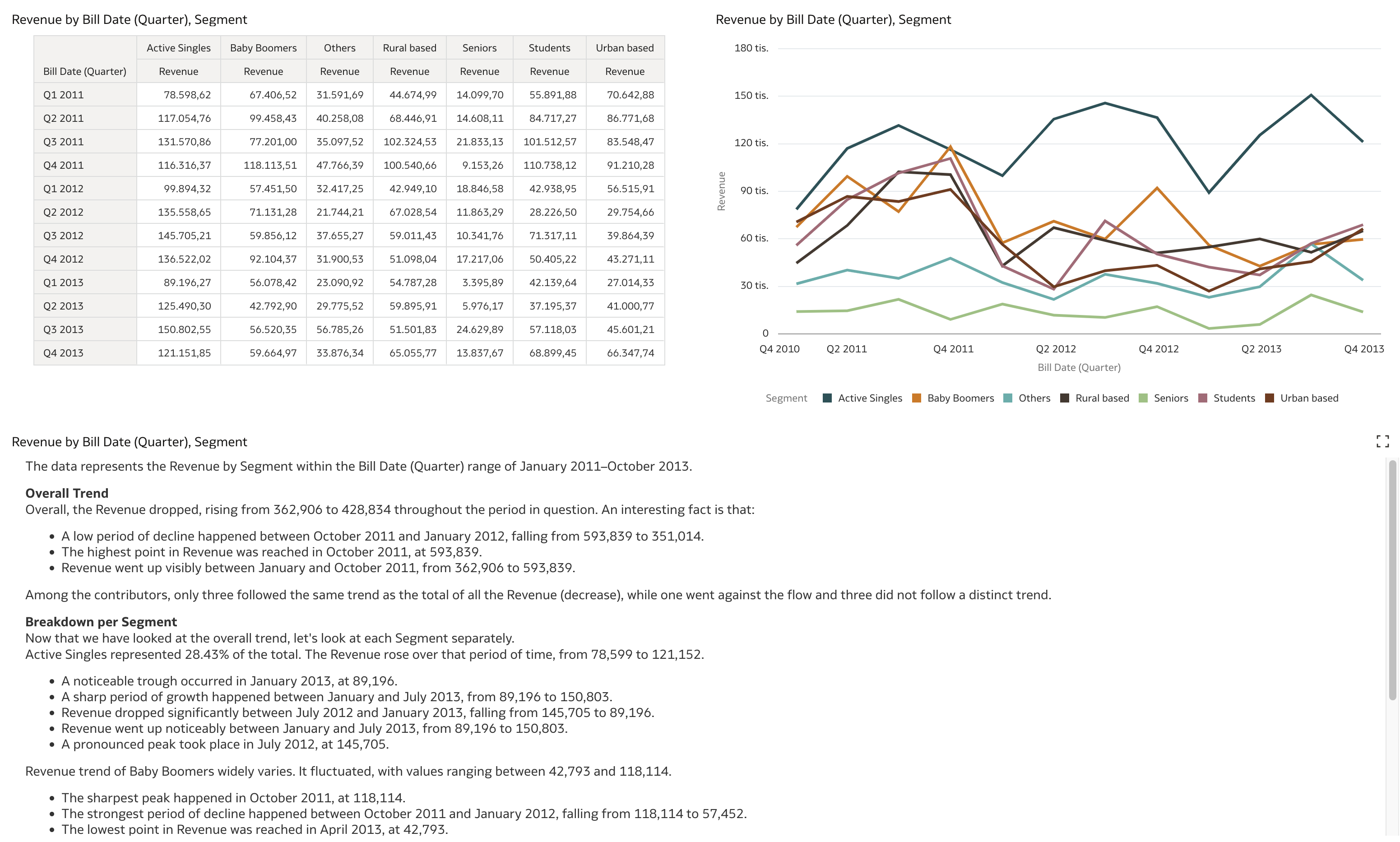
However, these examples don’t provide much insight. So, what happens if we take a step back and build this visualization from scratch? Another important factor is the mention of chronological order in the messages, which implies the use of a time dimension.
Let's see what happens if we use a time dimension attribute (Month) instead of a categorical one (Region).
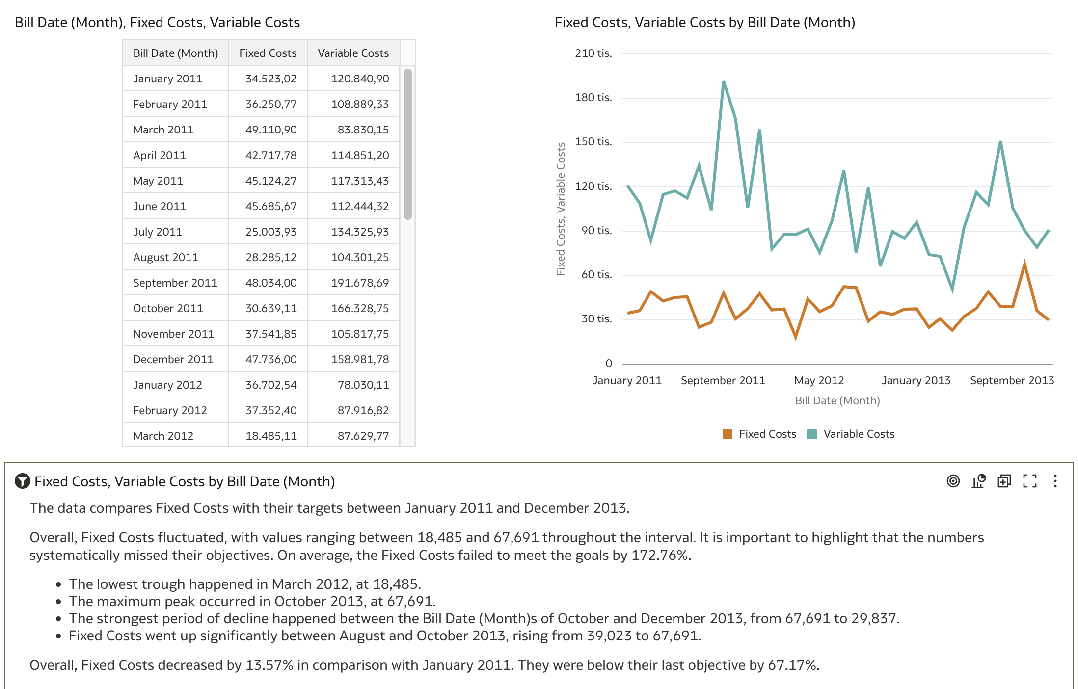
Now, the visualization generates more narrative than before and provides insights such as minimums, maximums, strongest declines, and so on. Interestingly, it also mentions fixed costs missing objectives and failing to meet goals. This is a bit odd, as sentences like these imply that variable costs are somehow targeted values for fixed costs.
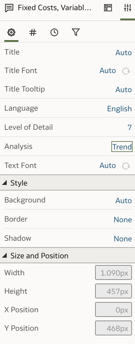
Can this be corrected or put into context? Navigating to the Visualization Properties panel gives users additional control over the Language Narrative.
First, there is the Language option. Currently, only English and French are supported, so this is important to keep in mind for other languages. Another property is the level of detail, which I will address shortly. The next property is Analysis, which has an immediate effect on the visualization.
The default value is Trend. Changing it to Breakdown produces the following effect:
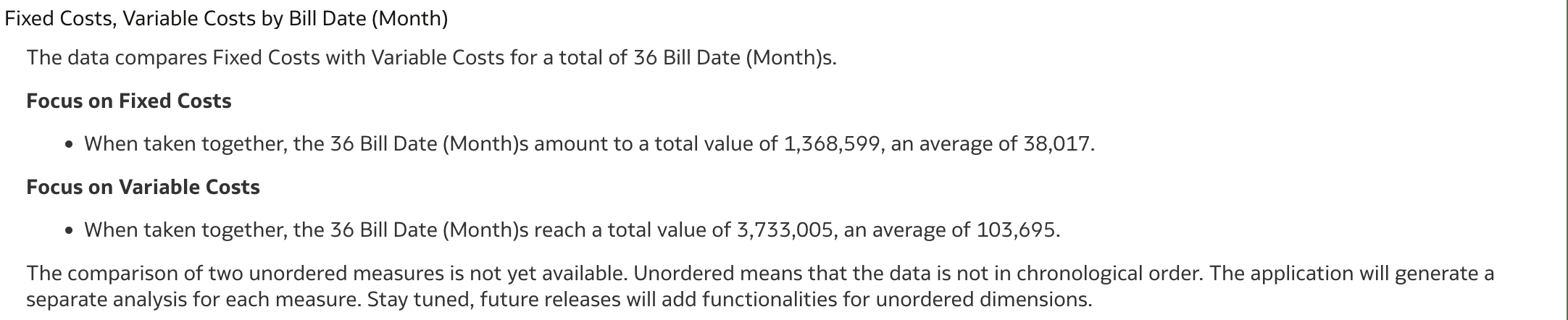
You can see that the generated text is now broken down much more thoroughly, providing deeper insight because there is more detail available (we are looking at a 36-month period). Of course, a bit more review of the generated text is needed, but it seems to capture the information in the table quite well. From the table alone, such details are not easily spotted.
The Level of Detail property was set to 7, which is the maximum level of detail. If this is changed to 5, for example, the generated text in Language Narrative becomes shorter and less detailed:
Let's revisit our initial example where we tried to generate a Language Narrative for one measure and two dimensions, with one of those being a time dimension.
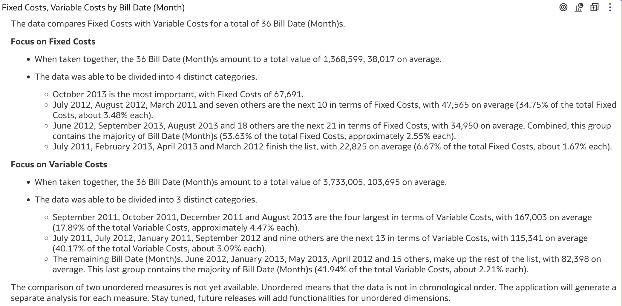
In this case, Language Narrative generates quite a lot of text. For Analysis = "Trend", it provides many textual insights. First, it analyzes the overall trend, then breaks down the trend by distinct values of the selected categorical attribute.
Switching the Analysis property to Breakdown changes the focus to a breakdown by the time dimension attribute.
Conclusion
In my brief exploration of the Language Narrative visualization type, I observed some impressive automatically generated texts by Oracle Analytics. While some outputs were less useful, many provided valuable textual insights that can enhance data understanding. However, using this feature simply because it looks impressive might not always be effective. Users should understand its capabilities and limitations and apply it thoughtfully in their visualizations.
For more details on working with the Language Narrative visualization, refer to the Visualize and Analyze Data chapter in the Visualizing Data and Building Reports in Oracle Analytics Cloud documentation. I strongly recommend reviewing this before incorporating Language Narrative into your projects, as you may encounter messages like this:
The comparison of two unordered measures is not yet available. Unordered means that the data is not in chronological order. The application will generate a separate analysis for each measure. Stay tuned, future releases will add functionalities for unordered dimensions.