Maps Conditional Formatting
Oracle Analytics Cloud (OAC) is now updated frequently on a bi-monthly basis, continuously adding valuable features that enhance user experience and analytical capabilities. The recent May Update, announced just a week ago, introduces several exciting new features and functionalities.
One feature that caught my attention is Maps Conditional Formatting—a powerful option that allows you to highlight key data points directly within map visualizations, just as you can with other chart types.
So, how does it work? It’s actually very straightforward, using the same conditional formatting model familiar to users from other visualization types.
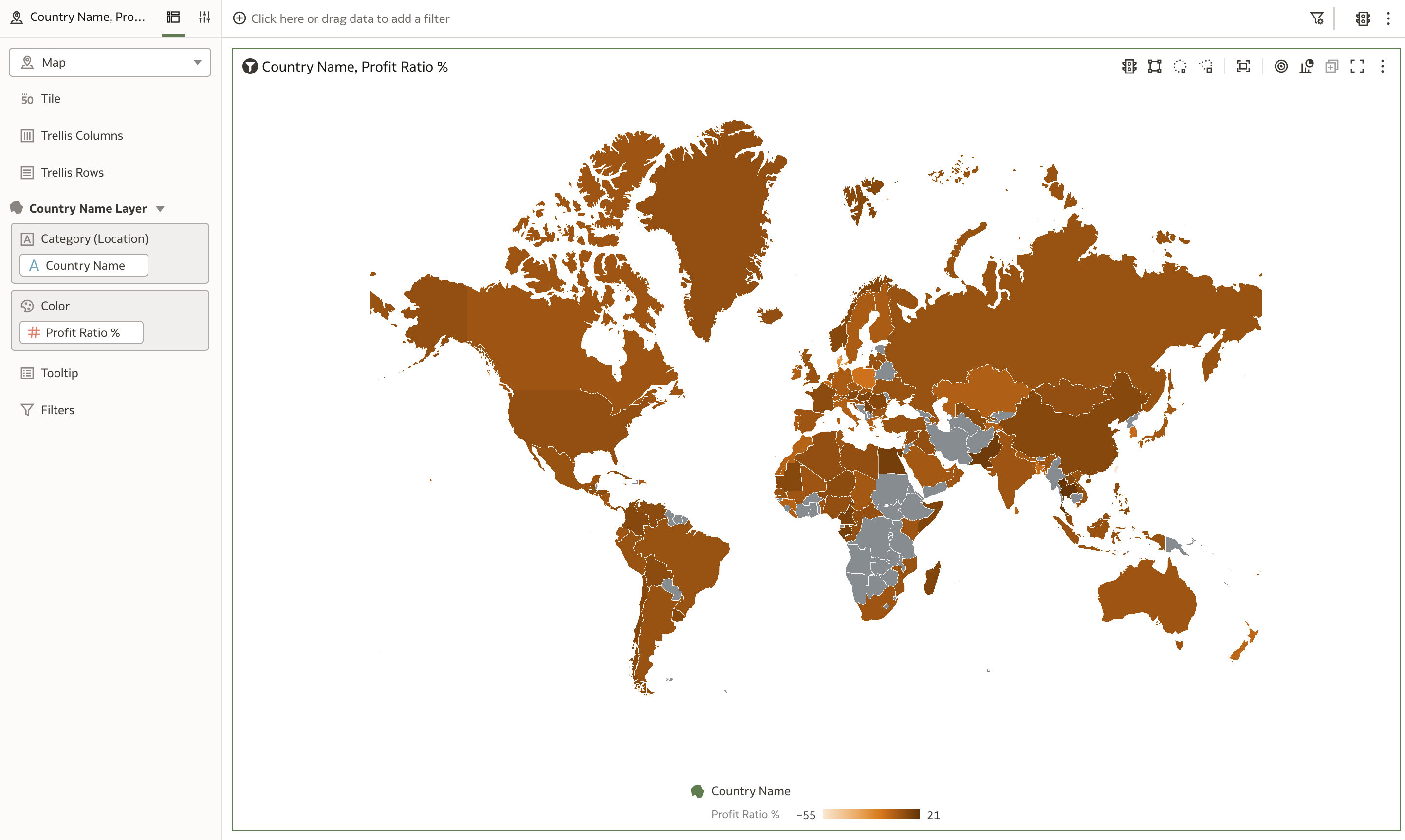
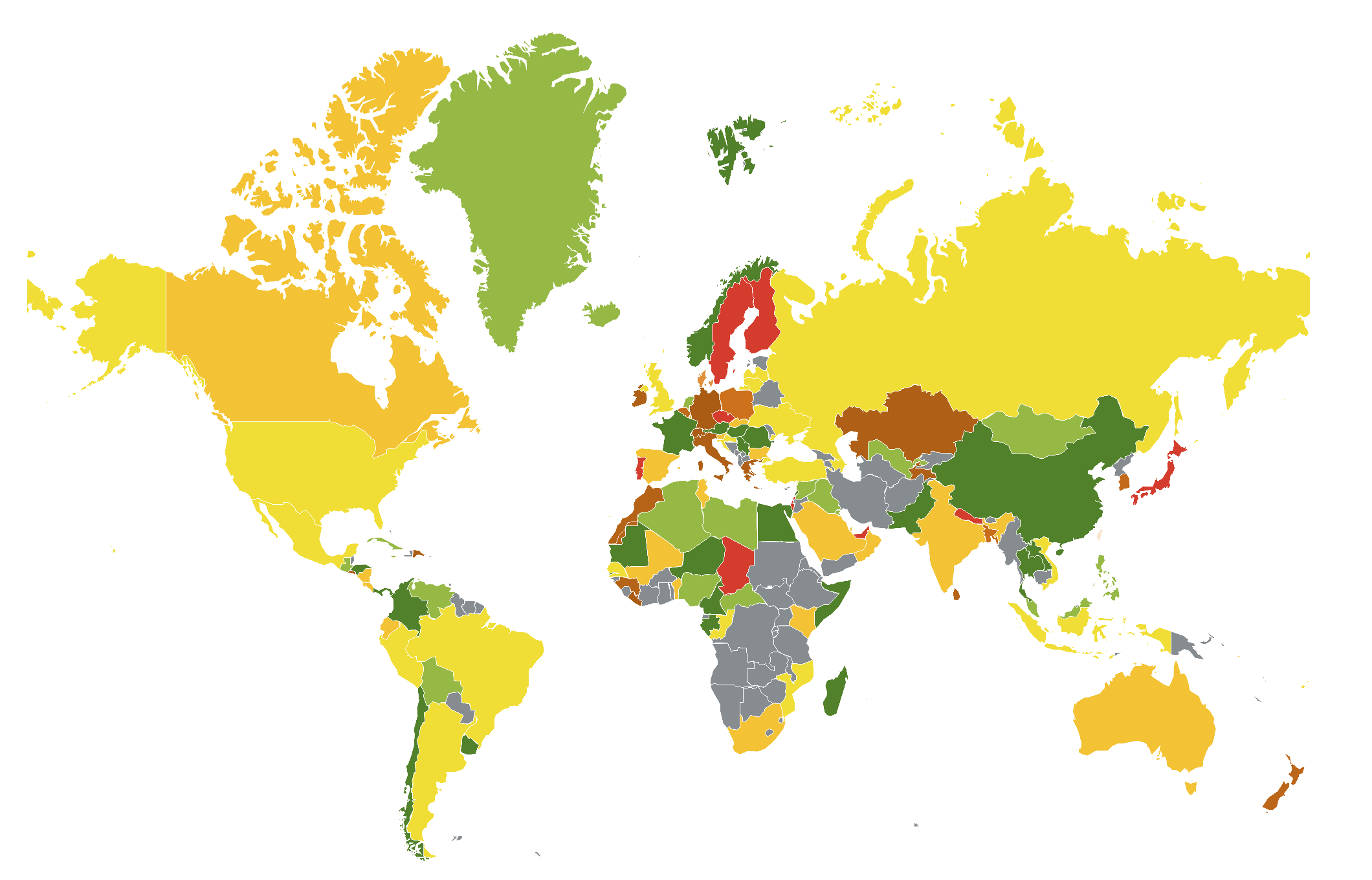
The map above is our starting point, showing profitability by country. Simple and clear, but without any conditional highlights.
To apply conditional formatting, click on the traffic light icon (Manage Conditional Formatting Rules). This opens the Conditional Formatting popup window.
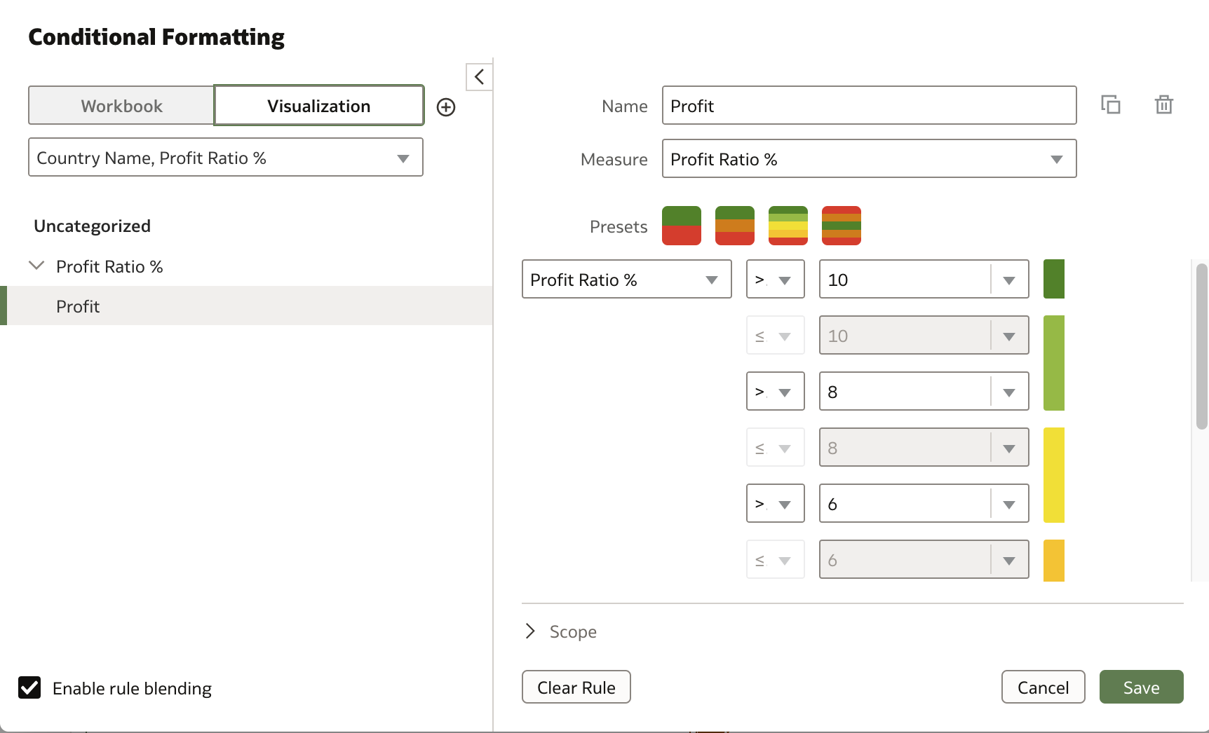
Here, you can choose whether the formatting applies to the entire workbook or just the selected visualization. Then, name your rule, select a measure—in this case, Profit Ratio %—and specify the value ranges and corresponding colors.
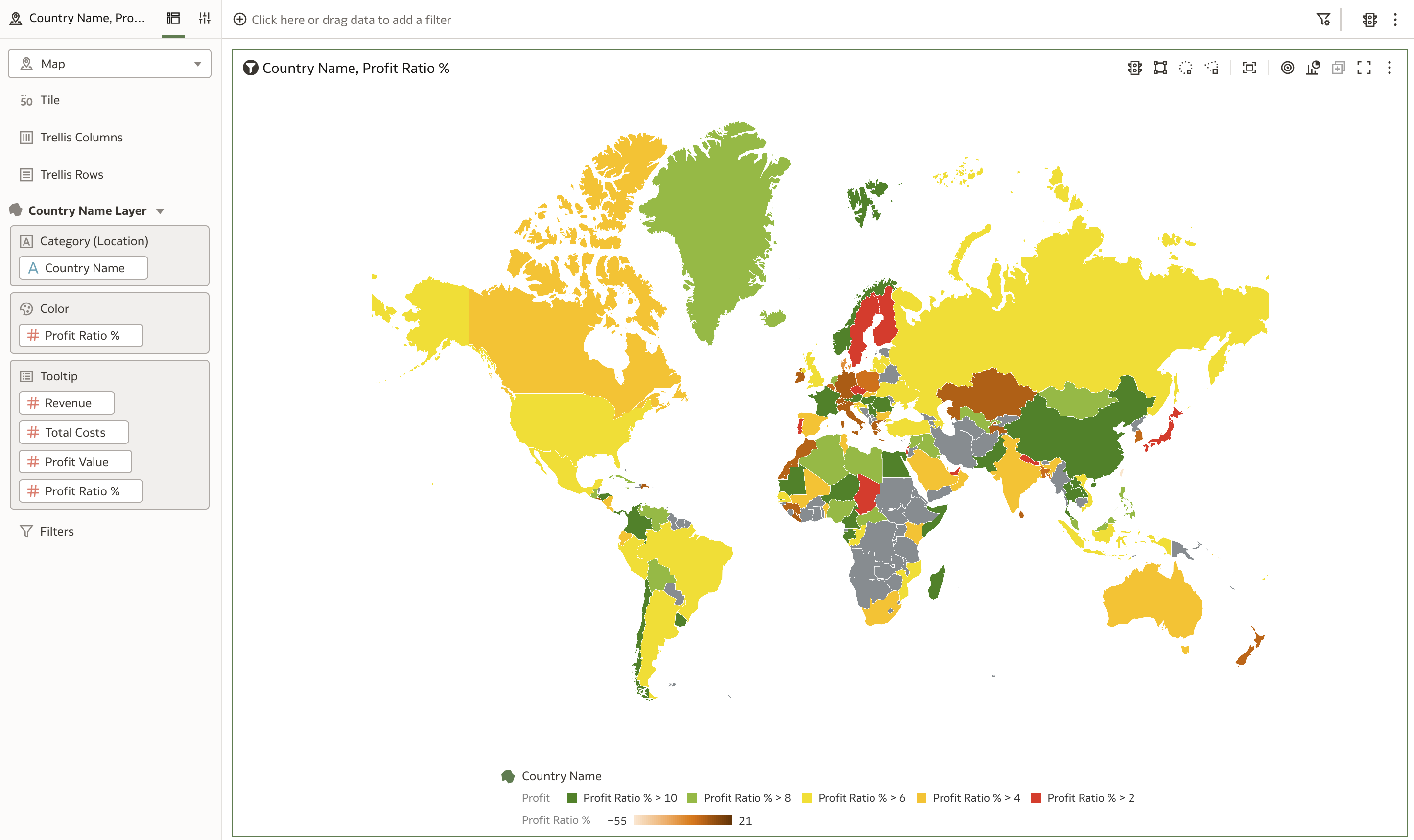
With just a few clicks, your map instantly reflects the conditional formatting, making it easier to spot important trends and outliers.
In summary, Maps Conditional Formatting enhances your ability to communicate insights visually and effectively within Oracle Analytics Cloud. I encourage you to explore this feature in your own workbooks and see how it can bring your data stories to life.