
Oracle Analytics 6.0 has arrived! Our Oracle Analytics instance was just patched a few hour ago.
Everyone who is using Interactive Dashboards and Analytics (even from OBIEE times) is familiar with hierarchical columns. They are very popular with users and in some cases, like working with OLAP cubes (ie. Essbase), necessary.
Oracle Data Visualisations (in the past) aka Oracle Analytics (today) lacked this functionality until now. In version 6.0 this has finally been included and here we are testing it.
Data Visualisations with Hierarchical Columns
Hiearchical Columns are the most applicable in tables or pivot tables, however they can be used in some other visualizations like trellis.
We will create a project first. Hierarchical columns can be defined in Oracle Analytics Data Models aka Subject Areas, Oracle Planning applications or Essbase cubes.

By selecting one of subject areas you can now see hierarchical columns in the data model in the Data panel:

Working with hierarchical columns is no different then with any other data element you'd like to include in your analysis. Simply double click on it or drag it to the canvas or choose Best visualisation option to bring it onto selected visualisation.

And then just add any additional attribute or a measure. You can add additional hierarchical columns to the same visualisation too.
Once you have your basic visualisation, for example pivot table, prepared you can start exploring.

For example, click on the right mouse button and choose Keep Selected.


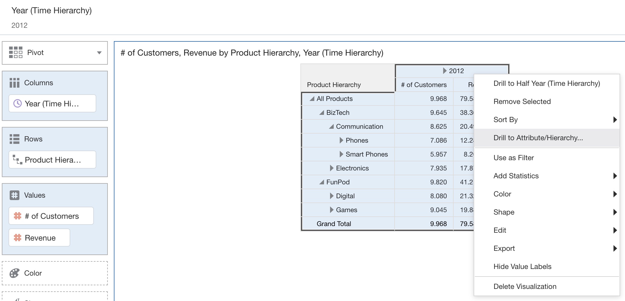
In our case, we are drilling to Quarter from Year, skipping Half Year level.

When Quarter is selected, table is altered with selected level of Time hierarchy.

Filtering on Hierarchical Columns
Very popular way of filtering is by "Use filter" function. For those from OBIEE days, this is the same as Master-Detail in Answers. So, by clicking on a specific value in one visualisation, all others are filter according to the selection.
Let's create additional visualisation first. Then click on the filter icon in the left-top corner of the first visualisation. Alternatively, this is also an option from the right mouse click menu. In either case, Use as filter is enabled.


If you click on any cell in the pivot table, charts below will be filtered based on that selection.

Let's explore "the regular filtering". In this case, column is moved to the filter row (above visualisations). You can see that Hierarchical Column as such cannot be moved there.

However, every member of the hierarchy can be moved into filter row.

And you can play with filters. There aren't any differences from the regular columns. For example, you can apply "Limit Values By" option.


So what to say, for the first test on Oracle Analytics 6.0? Hierarchical Columns are nice feature which was very missed, especially for those who are used to work with Interactive Dashboards and Analyses. At least for me, this is one of those "functionality check-boxes" of my list of missing features in Data Visualisation. Consider it ticked off.
