AI Data Platform Series: Gold Layer Arrivals Board

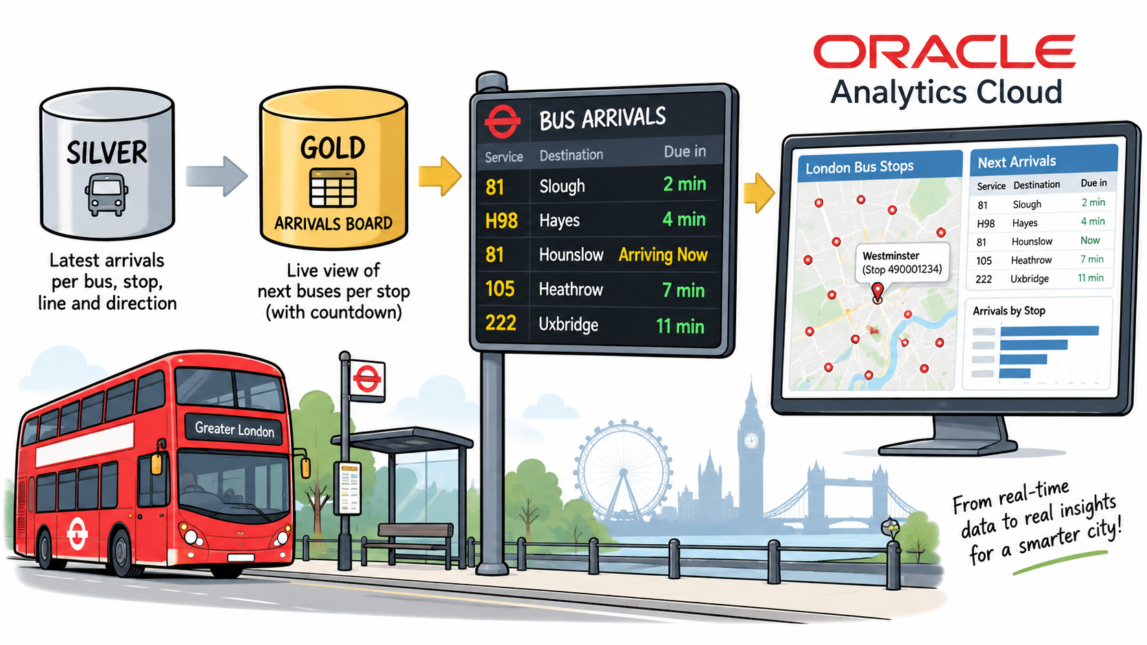
This is the sixth post in the AI Data Platform series, following Just Streams: Real-Time Data Pipelines on OCI (the series intro), Setting Up the AI Data Platform Environment (stage 0), OCI Streaming and the Stream Producer (stage 1), Bronze Layer: Spark Structured Streaming (stage 2), Silver Layer: Spark Structured Streaming (stage 3), and the Comparing Bronze and Silver with DBeaver detour. Silver gave me one clean, always-current row per bus, stop, line and direction. This post covers the first half of stage 4: turning that into a live arrivals board, the kind you see on a screen at a bus stop, and putting it in front of Oracle Analytics Cloud.
In this post I'll walk through:
- Why the arrivals board is a view, not another streaming job: and the three small decisions that make it actually "live".
- Building and testing the view: including a real stop that shows why I rank by stop ID rather than by station name.
- Resizing the cluster for OAC: what Oracle Analytics Cloud needs from an AIDP cluster before it will connect.
- Connecting OAC to AIDP: the dedicated Oracle AI Data Platform connection type, the
config.jsonit runs on, and the API key step. - An empty board that wasn't a bug: what happens when silver is catching up on a backlog.
- From a flat table to a map: a first OAC workbook with a bus-station map and an arrivals board behind it.
I split the gold layer into two posts. This one (4a) is the arrivals board and the OAC connection. The next one (4b) adds station coordinates and live bus positions, so the map can show where the buses actually are, not just where the stops are.
Recap: what we have so far
tfl.silver.arrivals_silver holds one row per (vehicleId, naptanId, lineId, direction), updated in place by a foreachBatch MERGE every few seconds. Each row carries the latest prediction TfL has for that bus at that stop, most importantly expectedArrival, the timestamp TfL expects the bus to arrive.
That's already a clean table, but it isn't something anyone would look at directly. A bus stop display asks a much simpler question: for this stop, which buses are coming next, and in how many minutes? That question is the gold layer.
Why a view, not another streaming job
The original July version of this demo built the arrivals board as a table, overwritten every few seconds by a clock-triggered streaming job. It worked, but it was a lot of machinery to fake one thing: a table that always reflects right now.
A plain SQL view does that for free. A view doesn't store anything; Spark runs its SELECT fresh every time someone queries it. No checkpoint, no trigger interval, no foreachBatch, nothing to start or stop. Whoever queries it (a notebook, DBeaver, or OAC) effectively is the trigger.
Three decisions shaped the view itself:
- Countdown computed live, not copied from TfL. Silver has a
timeToStationcolumn, the number of seconds TfL reported when it sent the prediction. The problem is that it freezes at whatever value silver last wrote. If a bus doesn't get a fresh prediction for a minute,timeToStationstill says "120 seconds" a minute later. So instead I computeexpectedArrival - current_timestamp()on every query. The countdown moves even when the data doesn't. - Ranked per stop (
naptanId), not per station name. A "station" name in TfL's data can cover several physical stops: both sides of a road, or several stands at a bus station. Ranking by name would mix buses going in opposite directions into one list. I rank bynaptanId, the unique ID of a single physical stop, and keep the top 5. - A 30-second grace period. A bus that was expected 10 seconds ago is probably pulling in right now, so dropping it the instant the clock passes
expectedArrivalwould feel wrong. The view keeps an arrival on the board for up to 30 seconds past its expected time, labelled "Arriving Now".
Building the view
Nothing new to create first: the gold schema already exists from stage 0, and a view doesn't need a table or a volume.
%sql
USE CATALOG tfl;
USE SCHEMA gold;
Before wrapping anything in CREATE VIEW, I ran the exact query on its own. A mistake then shows up as a query error, not as a broken view.
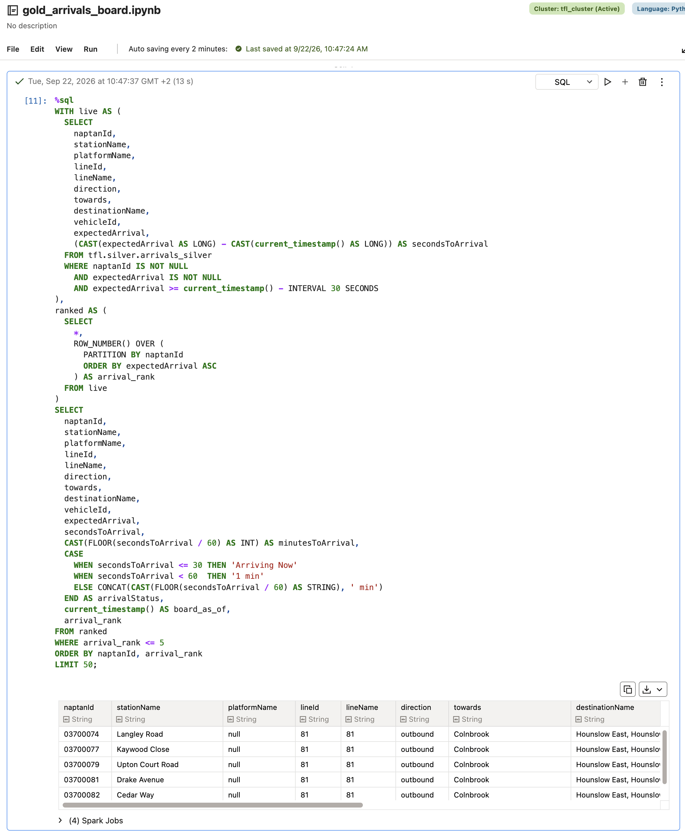
Once the results looked right (at most 5 rows per stop, ranks in expectedArrival order, small countdown values), I wrapped the same query in CREATE OR REPLACE VIEW. OR REPLACE is safe here: a view owns no data, so recreating it while iterating on the definition can't lose anything.
%sql
CREATE OR REPLACE VIEW tfl.gold.arrivals_board AS
WITH live AS (
  SELECT
    naptanId,
    stationName,
    platformName,
    lineId,
    lineName,
    direction,
    towards,
    destinationName,
    vehicleId,
    expectedArrival,
    (CAST(expectedArrival AS LONG) - CAST(current_timestamp() AS LONG)) AS secondsToArrival
  FROM tfl.silver.arrivals_silver
  WHERE naptanId IS NOT NULL
    AND expectedArrival IS NOT NULL
    -- 30-second grace: keep an arrival briefly after its expected time
    AND expectedArrival >= current_timestamp() - INTERVAL 30 SECONDS
),
ranked AS (
  SELECT
    *,
    ROW_NUMBER() OVER (
      PARTITION BY naptanId
      ORDER BY expectedArrival ASC
    ) AS arrival_rank
  FROM live
)
SELECT
  naptanId,
  stationName,
  platformName,
  lineId,
  lineName,
  direction,
  towards,
  destinationName,
  vehicleId,
  expectedArrival,
  secondsToArrival,
  CAST(FLOOR(secondsToArrival / 60) AS INT) AS minutesToArrival,
  CASE
    WHEN secondsToArrival <= 30 THEN 'Arriving Now'
    WHEN secondsToArrival < 60  THEN '1 min'
    ELSE CONCAT(CAST(FLOOR(secondsToArrival / 60) AS STRING), ' min')
  END AS arrivalStatus,
  current_timestamp() AS board_as_of,
  arrival_rank
FROM ranked
WHERE arrival_rank <= 5;
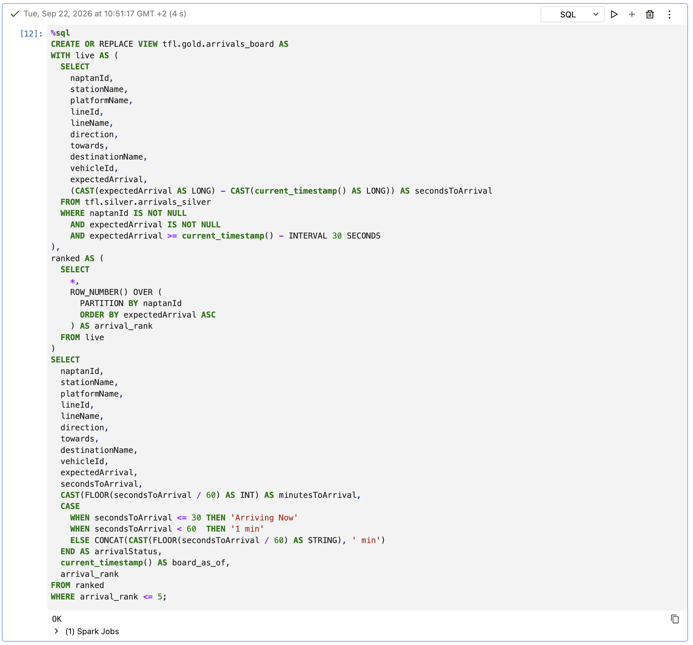
One small surprise: the view didn't show up in the Master Catalog browser. The Tables node under gold stayed empty after the CREATE VIEW, even though querying the view worked perfectly. As far as I can tell, AIDP's catalog explorer simply doesn't list views under a schema yet. It's a UI limitation, not a functional one, but worth knowing so you don't go looking for a view that's already there.
Why per stop, not per station: Langley Road
The best proof of the ranking decision turned up by accident. Filtering the view on stationName = 'Langley Road' returns three different naptanIds:
03700074: line 81, outbound, towards Hounslow03700075: line 81, inbound, towards Slough490018574S: a different route altogether, towards Hook
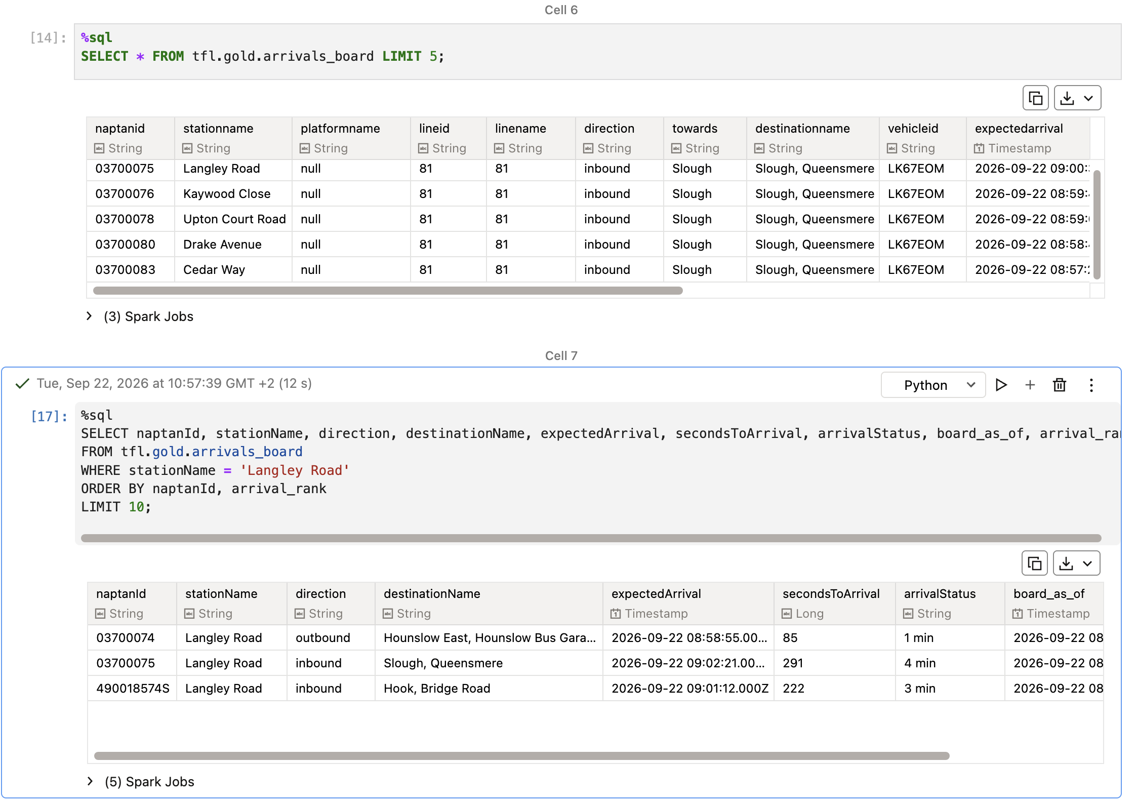
Three physical stops, three separate boards. If I'd ranked by stationName, someone waiting for the bus to Slough would see the Hounslow bus listed as "next".
Proving it's live
The whole reason for building a view is that there's no snapshot to go stale, so I checked that directly: run SELECT * FROM tfl.gold.arrivals_board, wait a few seconds, run it again. board_as_of moved forward, secondsToArrival counted down, and nothing in the notebook did any work in between. The view simply re-evaluated against the current time and whatever silver had merged in the meantime.
I also kept a fallback in the notebook, a corrected version of the old clock-triggered overwrite table, in case AIDP didn't support views or OAC couldn't see one. Neither turned out to be true, so it stayed unused.
Resizing the cluster for OAC
Up to now, tfl_cluster has been a small shape: 1 OCPU and 16 GB of memory, which was plenty for the bronze and silver streams. OAC's AI Data Platform connection has a stated minimum of 2 OCPUs, 32 GB of memory and at least 2 workers on the cluster it connects to.
I had a choice here: resize tfl_cluster, or stand up a second cluster just for OAC. I went with resizing. It means the streaming jobs and OAC's queries share the same compute, but for a demo that's simpler than running and paying for two clusters.
The resize itself is just an edit: stop the cluster, open Edit on tfl_cluster, switch to a custom configuration, and set the driver and workers to 2 OCPUs / 32 GB each, with a static count of 2 workers.
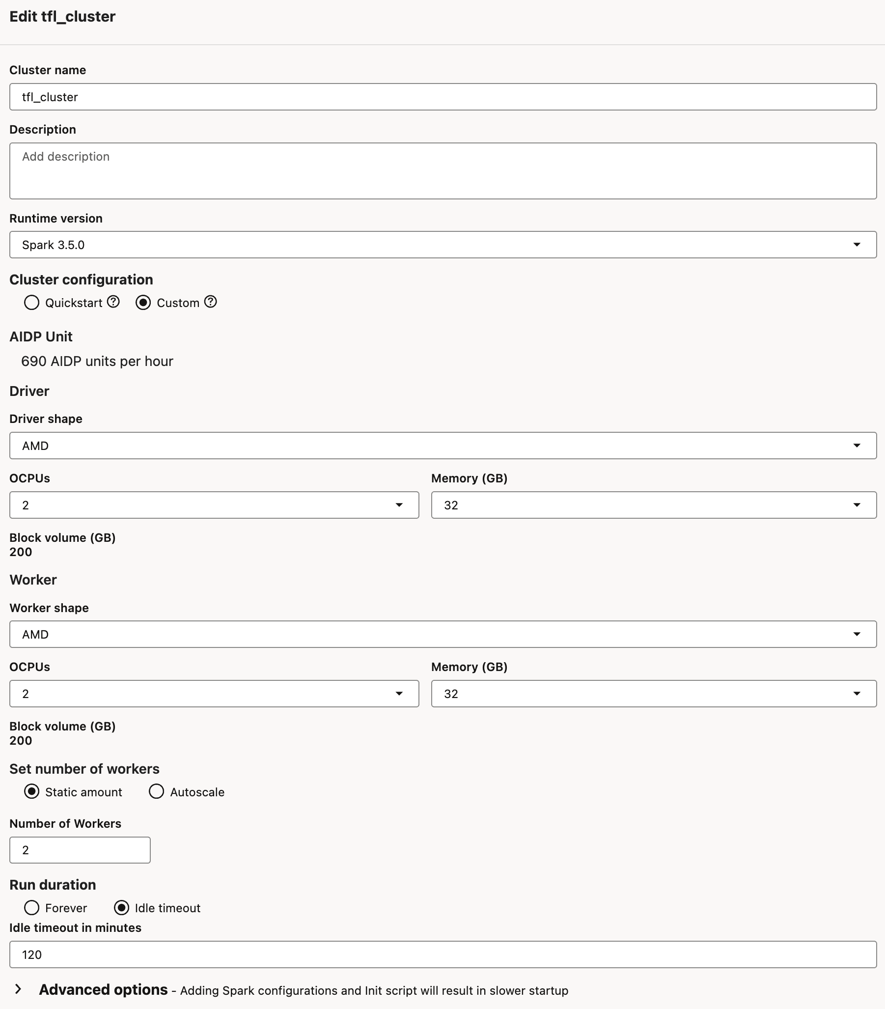
Note the AIDP Unit line at the top: the console tells you what the new shape costs per hour before you save it. That's the main reason I set an idle timeout (120 minutes) rather than letting the bigger cluster run forever.

Connecting Oracle Analytics Cloud
OAC has a dedicated connection type for AIDP, so this is a lot simpler than the JDBC driver setup from the DBeaver post. It starts on the AIDP side.
1. Download the connection file from AIDP
Each cluster has a Connection details tab with a Connect with BI Tool section. The Oracle Analytics Cloud tile downloads a config.json for that specific cluster.
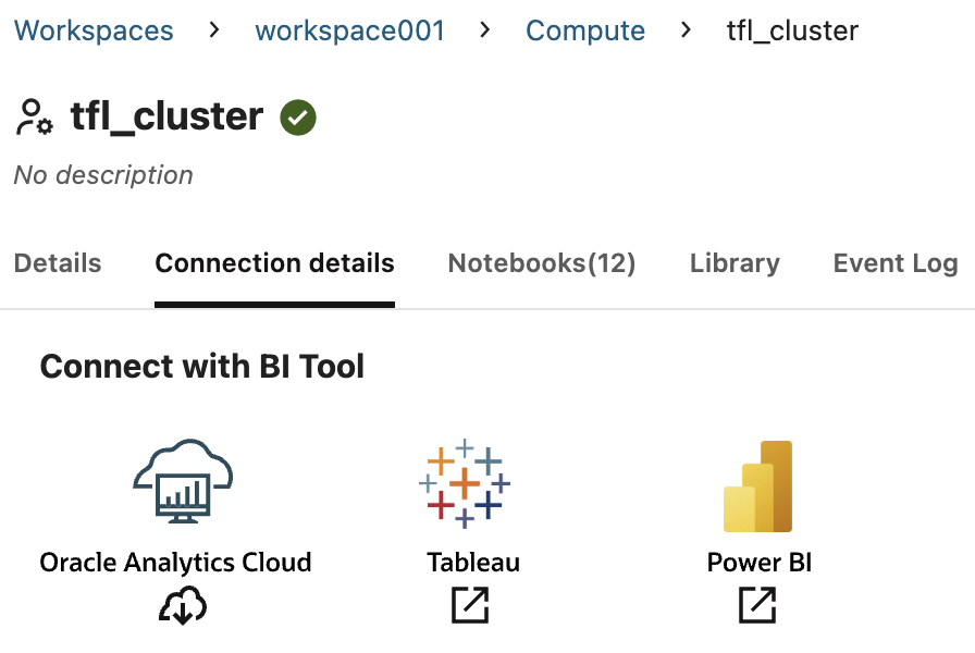
The file is small. With my own values redacted, its shape is:
{
  "username": "ocid1.user.oc1..aaaaaaaa...",
  "tenancy": "ocid1.tenancy.oc1..aaaaaaaa...",
  "region": "eu-frankfurt-1",
  "fingerprint": "ab:3d:83:78:aa:....:02",
  "dsn": "jdbc:spark://gateway.aidp.eu-frankfurt-1.oci.oraclecloud.com/default;SparkServerType=AIDP;httpPath=cliservice/...",
  "idl-ocid": "ocid1.aidataplatform.oc1.eu-frankfurt-1.amaaaaaa..."
}
One thing worth noticing: the httpPath part of the dsn contains the cluster's own ID. Resizing keeps the same cluster, so the file stays valid. If the cluster is ever deleted and recreated, though, the file has to be downloaded again and the OAC connection updated.
2. Create the connection in OAC
In OAC, Create > Connection, and search for "AI Data". There's exactly one match: Oracle AI Data Platform.
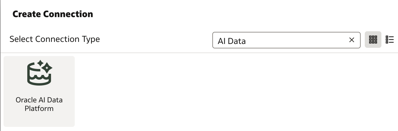
In the connection form, I selected the downloaded config.json under Connection Details, which fills in the DSN, user, tenancy and region automatically. For Authentication Type I used API Key.
The API key step is the only part that goes back and forth. OAC generates the key pair itself: click Generate next to Public API Key, then Copy. That public key then has to be registered on your OCI user, under your profile's API keys > Add API key > Paste a public key.
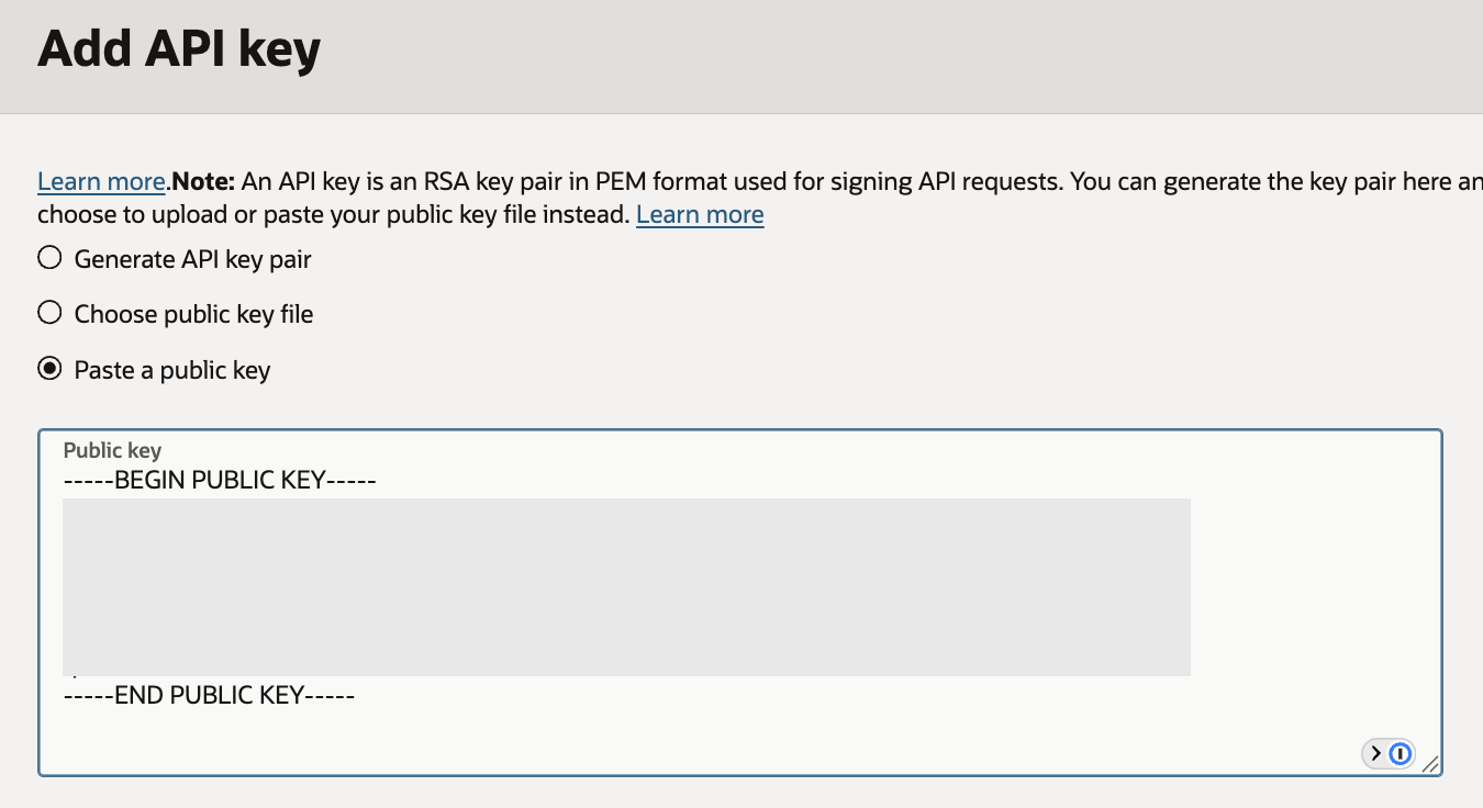
Back in OAC, clicking List next to Catalog confirms the whole chain works: it can only list catalogs if authentication succeeded. I picked tfl, the catalog from stage 0.
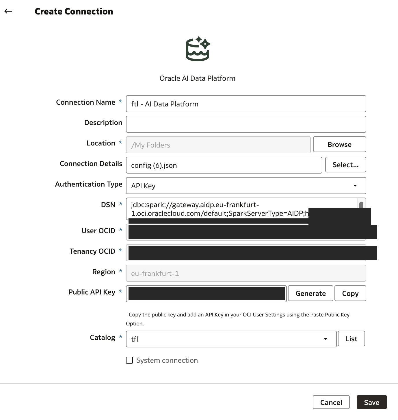
A small gotcha: OAC's Save button didn't visibly confirm on my first click, so I clicked again and ended up with two connections. Give the connection a deliberate name, so a duplicate is easy to spot and delete.
A dataset over a view
With the connection in place, a new dataset shows the tfl catalog's schemas, and under gold, there's arrivals_board.
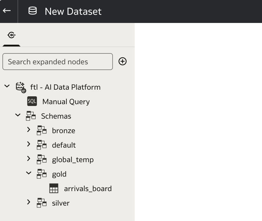
This was the question I'd been most unsure about going in: would OAC treat a view like a table? It does. The dataset editor picked up all 15 columns, with types, and profiled the data like any other source.
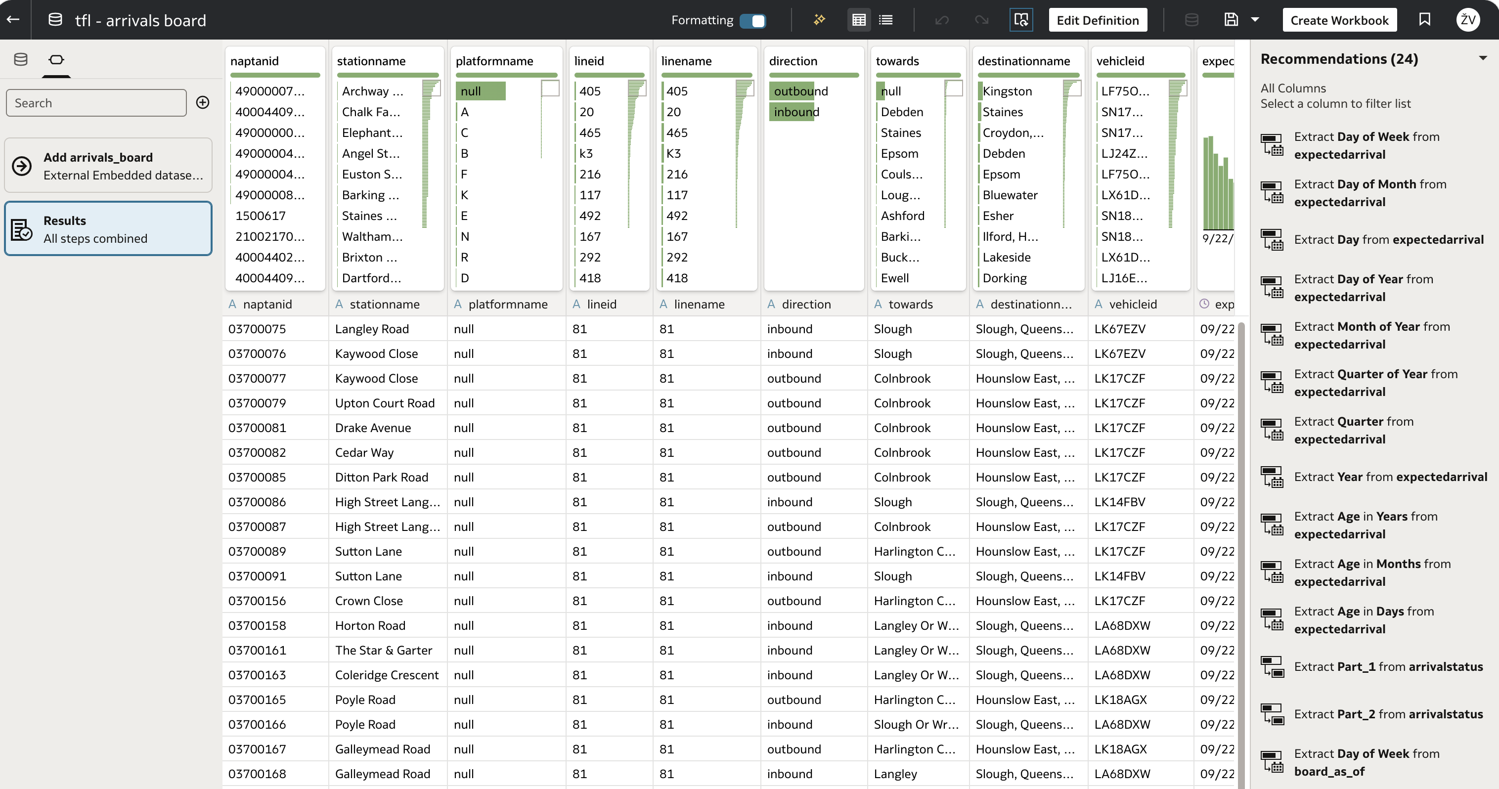
One detail you can see here: all column names arrive in lowercase (naptanid, stationname), even though the view defines them in camelCase. The metastore stores them that way. It doesn't matter much in OAC, where I rename columns to friendly names anyway, but it did matter later in Python code, which I'll get to in the next post.
An empty board that wasn't a bug
My first OAC workbook came back with no data. So did the same query in the notebook.
The reason was the cluster resize. Resizing meant stopping tfl_cluster, which also stopped the bronze and silver streams. While they were down, TfL kept publishing to OCI Streaming. When I restarted them, they started working through that backlog from where their checkpoints left off. Rows were landing in silver, ingest_ts was fresh, but the expectedArrival values in those rows were from several minutes ago: silver was replaying the past.
And the view did exactly what it was built to do. Every one of those replayed arrivals was more than 30 seconds in the past, so the grace filter correctly dropped all of them. An empty board was the right answer to "which buses are arriving now?", given that silver didn't know about now yet.
I watched the gap between the newest expectedArrival in silver and the wall clock shrink, from about 155 seconds to about 52 over a few minutes, as the streams caught up. Once the gap closed, the board filled in by itself.
I briefly considered widening the grace window to a few minutes, so the board wouldn't go empty after a restart. I decided against it: that would hide the catch-up rather than fix it, and once the streams are caught up, a 3-minute window would show buses that are long gone. The practical lesson is simpler: if you can, leave bronze and silver running rather than stopping them, and expect a short catch-up period whenever you don't.
The first workbook
Once silver had caught up, the first workbook was deliberately plain: every column of the view in a flat table.
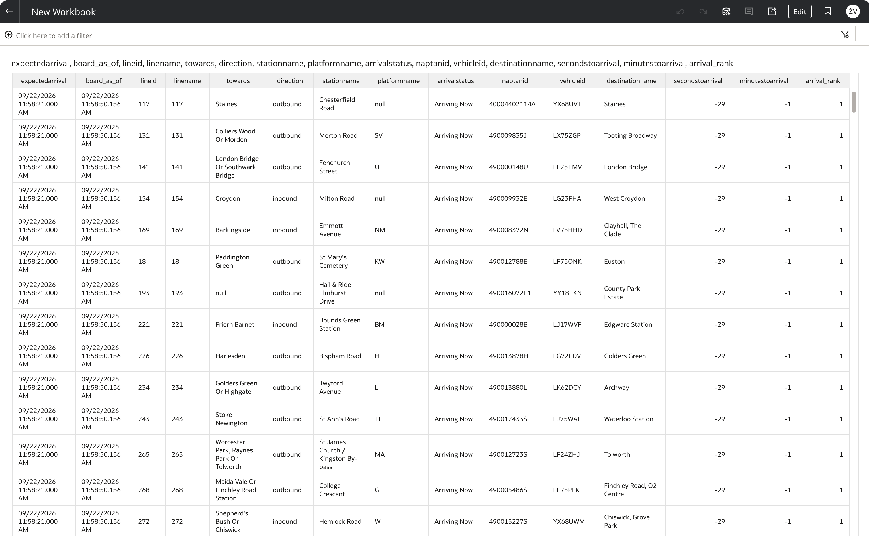
It's not pretty, but it proves the point. Look at expectedarrival (11:58:21) and board_as_of (11:58:50): 29 seconds apart. secondstoarrival is -29, and arrivalstatus is still "Arriving Now". That's the 30-second grace window, visible in OAC, computed at the moment OAC ran the query.
From a flat table to a map
A flat table is fine for checking the data, but an arrivals board is really about places. So the next step was a map.
At this stage, the view has no coordinates, only stop IDs and station names. To put stations on a map without waiting for 4b, I used TfL's own Bus Stops dataset from their GIS open data hub, downloaded as GeoJSON (about 21,500 stops), and uploaded it to OAC as a custom map layer. I added a stationname property to each feature so the layer's key matches the view's stationName column, which lets OAC place any row of arrivals_board on the map by its station name.
The workbook has two canvases:
- Bus Stops Map: a map visualization with Station Name as the location, filtered to 11 of London's main bus stations.
- Bus Stop Arrival Board: a table with station, stop ID, line, direction, destination, expected arrival and status, coloured by destination, with arrows for inbound and outbound.
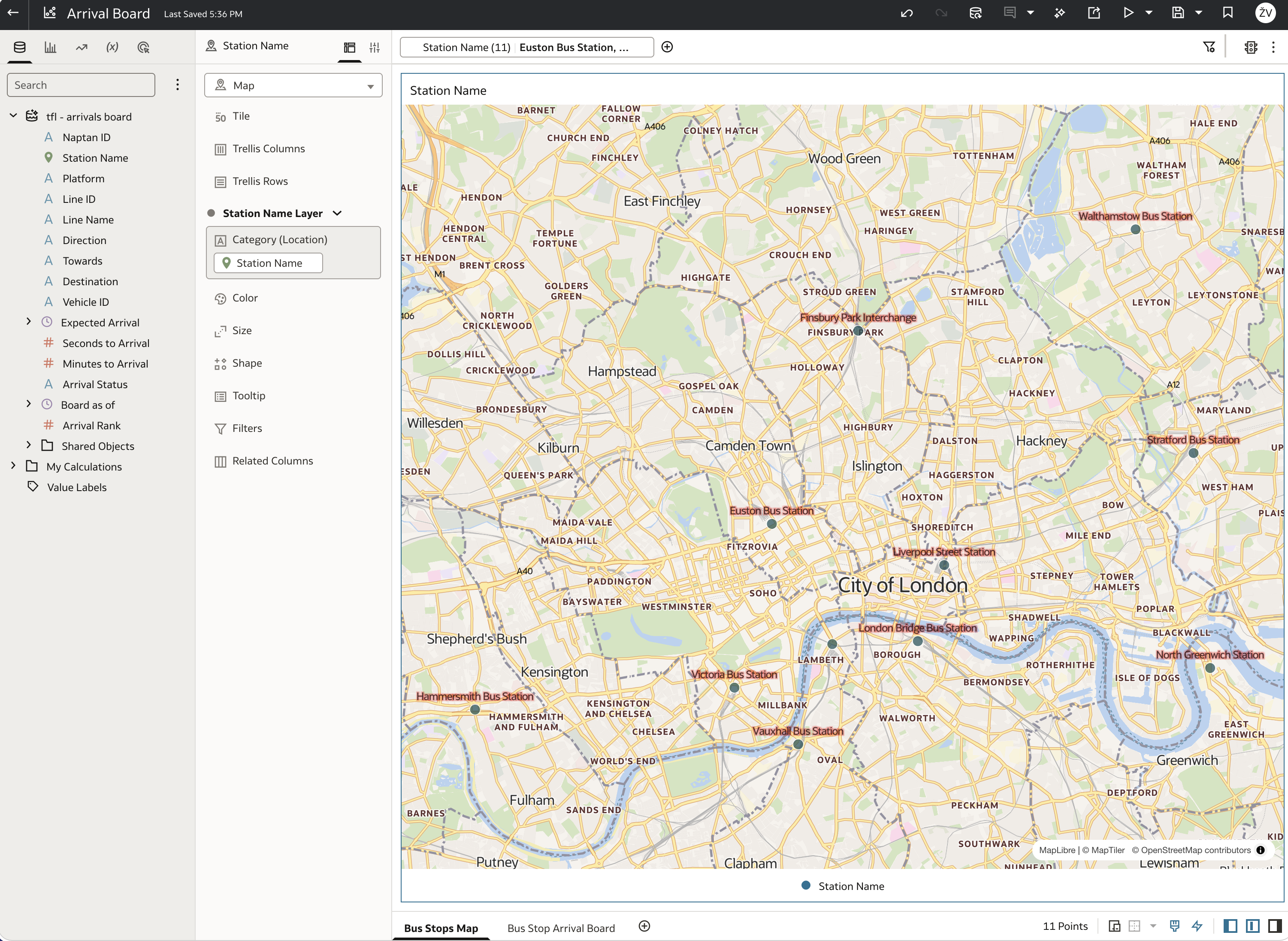
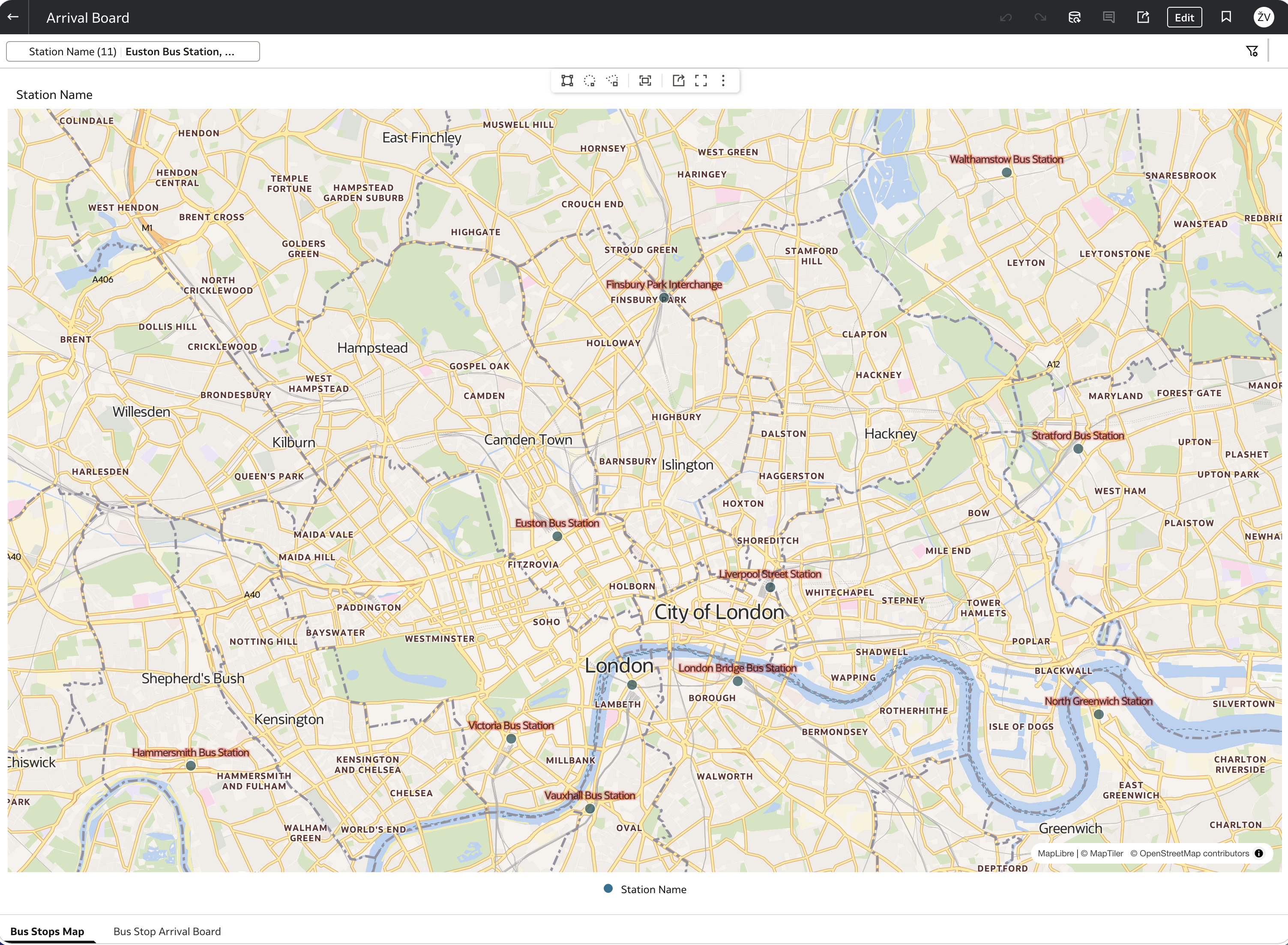
Clicking a station opens its arrivals board, filtered to that one station.
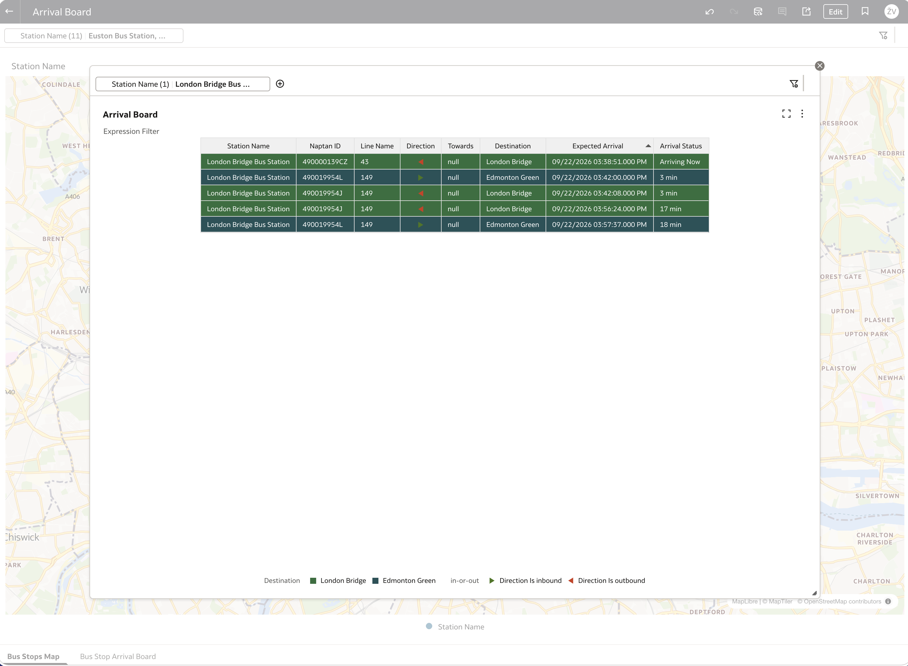
Two things are worth pointing out in that board. First, it lists three different stop IDs (490000139CZ, 490019954L, 490019954J) under one station name. That's Langley Road again, at a bigger scale: a bus station is many stops, and the board is really the top arrivals for each of them. Second, the map is only as precise as the station name. Every stop called "London Bridge Bus Station" lands on the same point. That's good enough to pick a station, but it can't show individual stops, let alone where a bus is between them.
That's exactly what the next post fixes.
What's next
tfl.gold.arrivals_board is live, OAC can query it, and a first workbook shows arrivals per station on a map. The chain now runs end to end: live TfL data, OCI Streaming, bronze, silver, a gold view, OAC.
In the next post (4b), I'll build a proper stations reference table with coordinates for every stop on every bus line, straight from TfL's own API, and then use it, together with silver's prediction history, to estimate where each bus actually is between stops, and put those positions on the map.
Related: Just Streams: Real-Time Data Pipelines on OCI (series intro), Silver Layer: Spark Structured Streaming, Comparing Bronze and Silver with DBeaver