With the development of Oracle Analytics Cloud (and it’s on-premise versions), users were able to use spatial information stored in GeoJSON format. Process of bringing spatial information and later using in analyses was dramatically simplified. You just need to prepare your map in the GeoJSON format (for example, you can use Oracle Spatial Studio), upload it to Oracle Analytics and apply corresponding background map. The only condition is that there is a key match with data you wanted to analyze. A couple of minute effort, nothing more. If at all since there are some preseeded maps layers and background maps available in Oracle Analytics.
In the latest edition of Oracle Analytics, version 5.6, users have additional ability to create a custom map from scratch in the tool itself and they will not spend more than a couple of minutes to do that. What you need is a background map, which you would use a basis for your custom layers, and some patience when you draw your custom shapes to be used with that background map.
Setting the scene
Let’s look at the example. The starting point is the following Oracle Analytics project:
The analysis above presents Sales by Gender. You can see sales through the last couple of years presented in Stacked Bar chart in which sales to female customers is presented with blue color and sales to male customers is green. You can also see (polynomial) total trend displayed. Map below is actually “out-of-box” map presenting sales split by gender in different geographies. And “visualization” on the right is a autogenerated narrative explaining sales data by gender.
The idea is to create an option to filter this analysis by gender. In Oracle Analytics you can do that simply by adding additional visualization and specify that this should be used as a filter. By selecting a value (in our case F for female and M for male), we can present data filtered by gender.
This solution works, but it consumes a lot of white space which we would like to minimize. Additionally, we would like to add some more interactivity to the solution. That is why we will introduce and embed “gender visualization” in the form of a custom map layer.
Adding a new custom map layer
In order to a new custom layer you need to upload an image that will be used as a background image.
We will use this image for gender selection:
In order to add a maps you need to navigate to Oracle Analytics Console.
Under Maps you can import background maps and add new layers.
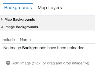
Navigate to Backgrounds and expand Image Backgrounds.
Click Add Image to choose your image file or drag and drop that file to an area that displays when you hover with a pointer.
Click Save to complete this task.
New image, called “gender” has now been uploaded. Click on the action menu located next to image name and select Create Map Layer.
You have to make two shapes which encapsulate female and male icons.
Don’t worry if you didn’t draw exactly to the line. You can always click on each of the dots and correct it one by one. It is really simple, easy and fun.
For each of the “dotted shapes” you need to update the Features list which has to have the same value as columns in your data set.
In this case we have two values: F and M, for each shape respectively.
Our custom map layer can now be saved. And we can now replace the original visualization with the new Gender visualization.
Storytelling
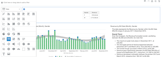
Open your data visualization project and change visualization type from Table to Map.
Table visualization type is now replaced with new custom map layer, which is based on the image we have uploaded as a background. Icons are also colored green. Dark green corresponds to higher revenue for M and light green means lower revenue for F.
Visualization’s behavior hasn’t changed from the table version. If you clicked on male icon, other visualization objects are filtered by this selection. Clicking on female icon, report is filtered for female.
But we can also see that there is quite a lot of white space around our two icons. We can simply change this by rearranging all of the visualization objects.
Open Canvas properties (menu associated with canvas name at the bottom of the screen) and change Canvas Layout from Auto Fit to Freeform.
Rearrange visualization object by resizing each of the objects, like that:
That’s it. You are ready to tell the story.
Click on Narrate tab on the top, drag canvas onto the ribbon (at the bottom) and click Present.
Storytelling starts presentation mode. Custom maps never been that easy, would you agree?


