AI Data Platform Series: Gold Layer Vehicle Movements

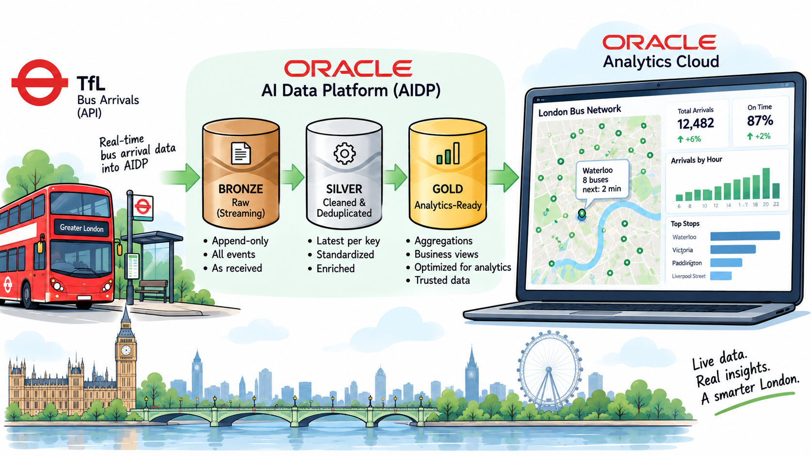
This is the seventh post in the AI Data Platform series. The previous post built tfl.gold.arrivals_board, a live view of the next buses at every stop, and connected it to Oracle Analytics Cloud. What it couldn't do was say where anything is: TfL's arrivals feed carries stop IDs and names, but no coordinates. This post adds them. First a reference table with the location of every stop on every bus line, then an estimate of where each bus on line 25 actually is right now, drawn along the real road it drives on.
In this post I'll walk through:
- A stations table from TfL's own API: every stop on all 674 bus lines, with coordinates, and proof that it joins cleanly to the arrivals board.
- A free extra in the same API response: TfL's own route geometry, the line a bus actually drives along.
- Where is the bus?: why silver already holds each bus's stop-by-stop history, and how a plain SQL view turns that into "40% of the way from stop A to stop B".
- Three real problems: stale rows after a pause, a column-name case surprise, and TfL using two different ID systems for the same stops.
- Running it on a clock and putting it on a map: live bus positions in OAC, next to the route's stops.
Recap: a map that only knew station names
At the end of the last post, the OAC workbook had a map, but it placed arrivals by station name, using a stop list downloaded from TfL's open data hub. That was good enough to pick a bus station, but every stop called "London Bridge Bus Station" landed on the same point, and nothing could show a bus between stops.
To do better I needed two things: real coordinates for every individual stop, keyed by the same naptanId the arrivals board uses, and a way to estimate a moving bus's position from data that only ever says "this bus is expected at stop X at time T".
Part 1: the stations table
Credentials, reused
TfL's reference data (lines, routes, stops) comes from the same Unified API as the live arrivals, so I didn't need a new registration. The stream producer from stage 1 already has an app key. I added that same key to AIDP's Credential Store as a new secret, tfl_reference_api, so the notebook reads it the same way bronze and silver read the Kafka credentials, rather than having it pasted into a cell.
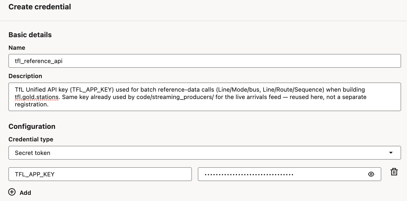
TFL_APP_KEY = aidputils.secrets.get(name="tfl_reference_api", key="TFL_APP_KEY")
print(f"Key loaded, length={len(TFL_APP_KEY)}")  # never print the key itself
Can the cluster reach the internet?
This was the one real unknown going in. Until now, every notebook in this series only talked to OCI Streaming, inside OCI. This is the first time a cluster notebook calls a public internet API, api.tfl.gov.uk, and I didn't know whether tfl_cluster's network allowed that.
So before building anything, I made one cheap call that doesn't even need the key:
import requests

resp = requests.get("https://api.tfl.gov.uk/Line/Meta/Modes", timeout=15)
print(resp.status_code)
print(resp.json()[:5])
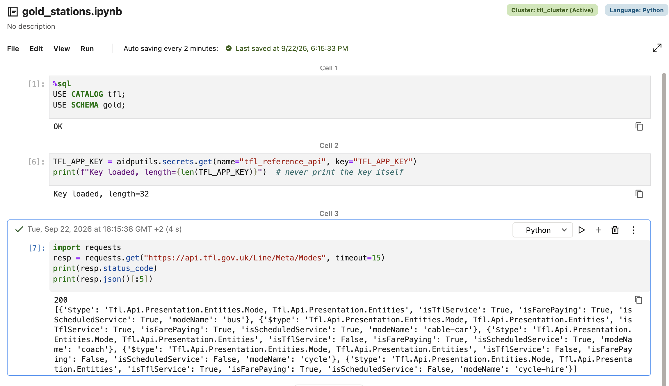
A 200 and a list of transport modes. No network changes needed.
Every line, every stop
The build has two steps. GET /Line/Mode/bus returns every bus line TfL runs, 674 of them. Then, for each line and each direction, GET /Line/{id}/Route/Sequence/{direction} returns the route, including a stations array with each stop's ID, name, latitude and longitude.
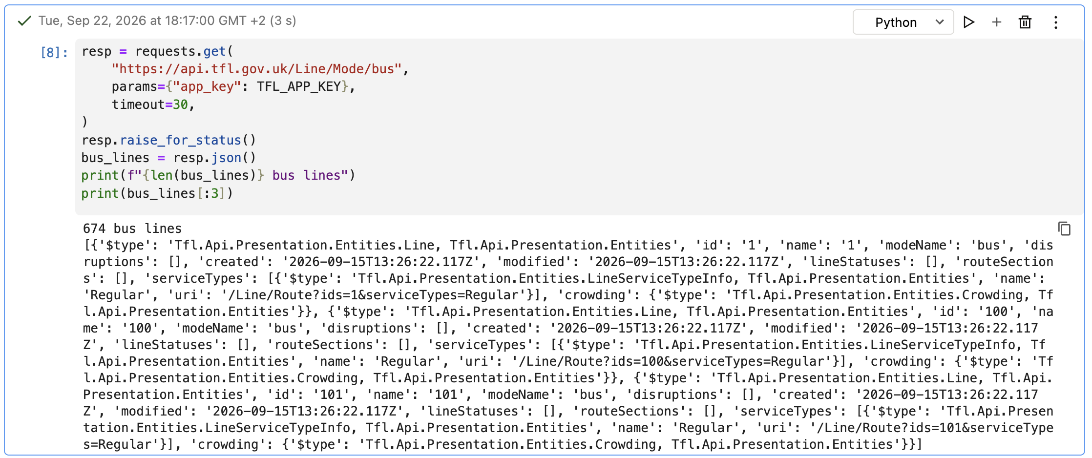
That's about 1,350 API calls, so the loop is paced to stay under the key's rate limit (500 requests a minute), with a simple retry if TfL answers with HTTP 429 (too many requests):
import time

DIRECTIONS = ["outbound", "inbound"]
REQUEST_DELAY_SEC = 0.15  # ~400/min ceiling, under the 500/min product limit
MAX_RETRIES = 3

rows = []
skipped = []

for i, line in enumerate(bus_lines):
    line_id = line["id"]
    line_name = line.get("name", line_id)

    for direction in DIRECTIONS:
        url = f"https://api.tfl.gov.uk/Line/{line_id}/Route/Sequence/{direction}"
        attempt = 0
        while True:
            attempt += 1
            resp = requests.get(url, params={"app_key": TFL_APP_KEY}, timeout=30)
            if resp.status_code == 429 and attempt <= MAX_RETRIES:
                time.sleep(2 * attempt)  # back off and retry
                continue
            break

        if resp.status_code != 200:
            skipped.append((line_id, direction, resp.status_code))
            time.sleep(REQUEST_DELAY_SEC)
            continue

        data = resp.json()
        for stop in data.get("stations", []):
            rows.append({
                "naptan_id": stop.get("id"),
                "station_name": stop.get("name"),
                "direction": direction,
                "line_id": line_id,
                "line_name": line_name,
                "lat": stop.get("lat"),
                "lon": stop.get("lon"),
            })

        time.sleep(REQUEST_DELAY_SEC)

    if (i + 1) % 50 == 0:
        print(f"{i + 1}/{len(bus_lines)} lines done, {len(rows)} rows so far, {len(skipped)} skipped")

print(f"Done: {len(bus_lines)} lines, {len(rows)} raw rows, {len(skipped)} line/direction combos skipped")
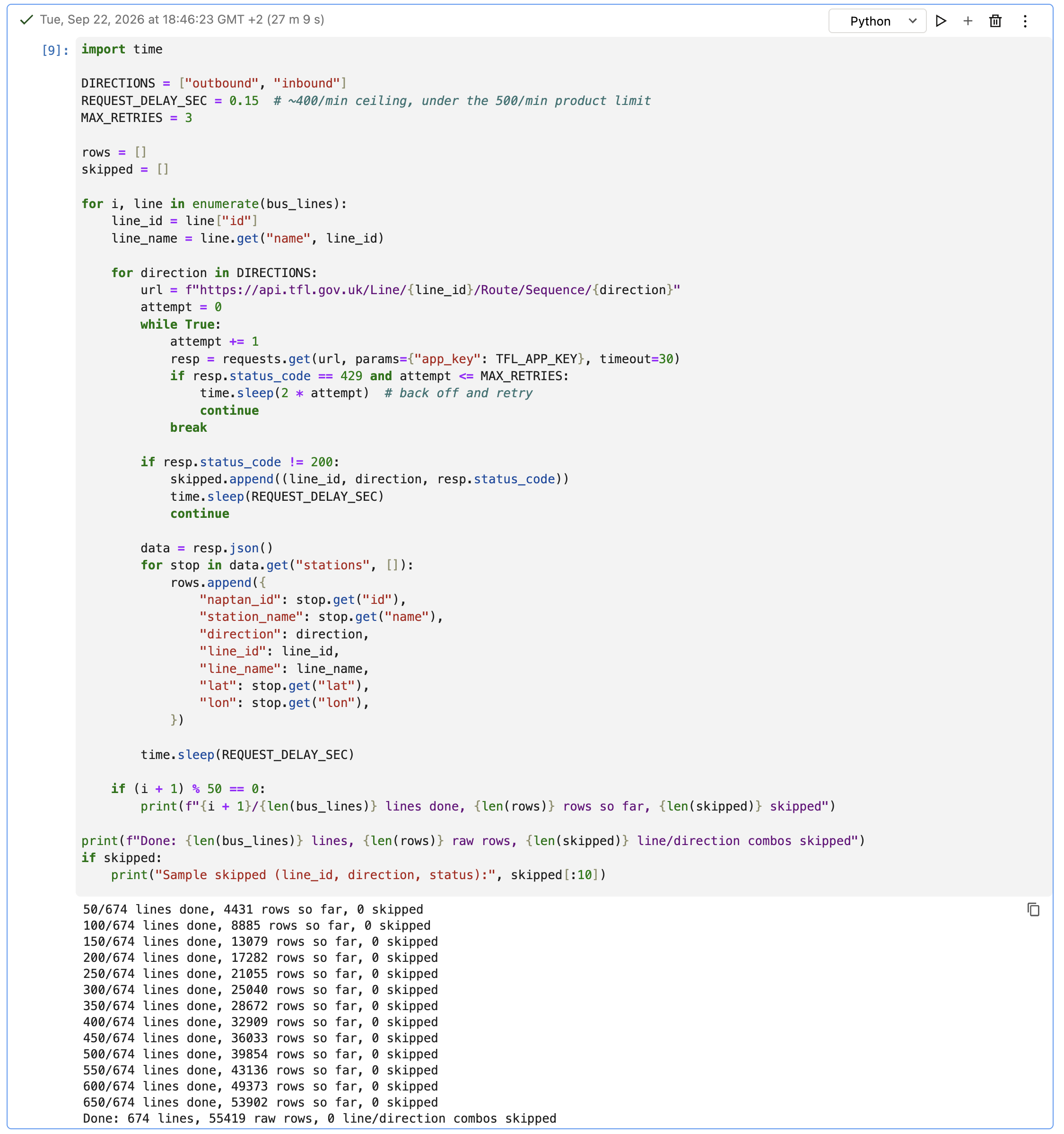
It took 27 minutes, and nothing failed. I'd expected a few skips from lines that only run in one direction, but TfL answered every request.
The result lands as a plain catalog-managed table, fully overwritten on each run. This is reference data, not history, so there's nothing to merge.
from pyspark.sql import Row
from pyspark.sql.functions import current_timestamp

GOLD_TABLE = "tfl.gold.stations"

stations_df = (
    spark.createDataFrame([Row(**r) for r in rows])
    .dropDuplicates(["naptan_id", "line_id", "direction"])
    .withColumn("updated_at", current_timestamp())
)

stations_df.write.mode("overwrite").saveAsTable(GOLD_TABLE)
Does it join?
A row count proves very little here. If the stations table's IDs were formatted even slightly differently from the arrivals board's (zero-padded, say), the table would look perfectly fine and still match nothing. So besides the basic counts, I joined the two tables directly and sorted by the number of matches, lowest first, so any stop on the live board without coordinates would appear at the top.
%sql
SELECT
  b.naptanid,
  b.stationname,
  s.lat,
  s.lon,
  count(*) AS stations_rows_matched
FROM tfl.gold.arrivals_board b
LEFT JOIN tfl.gold.stations s
  ON s.naptan_id = b.naptanid
GROUP BY b.naptanid, b.stationname, s.lat, s.lon
ORDER BY stations_rows_matched ASC
LIMIT 30;
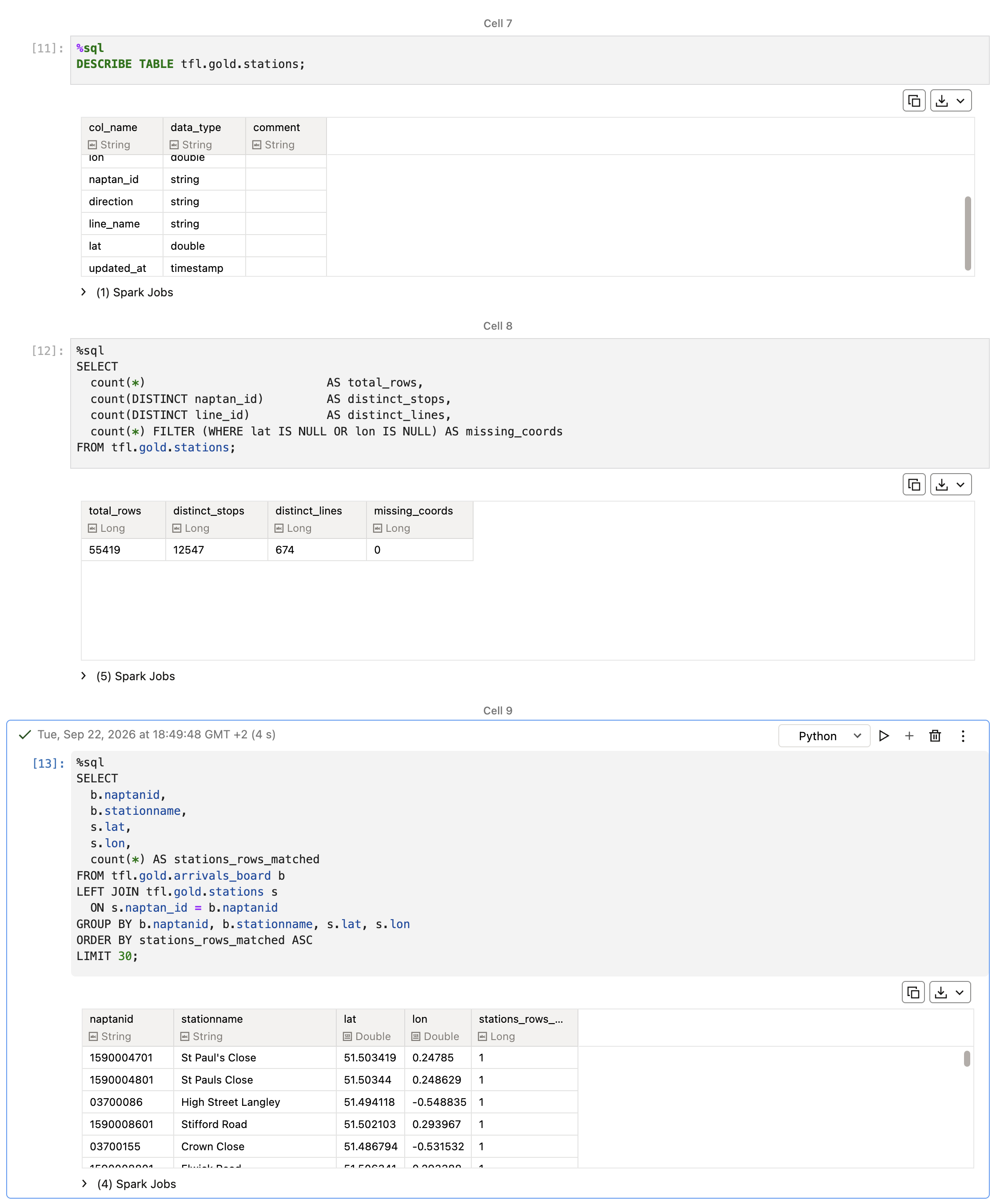
55,419 rows, 12,547 distinct physical stops, all 674 lines, zero missing coordinates. The join is the part I care about: even the least-matched stop on the live board finds a row with real coordinates. Every stop the arrivals board knows about can now be placed on a map precisely.
The free extra: route geometry
While looking at the Route/Sequence response, I noticed it has another field besides stations: lineStrings. It's TfL's own route geometry, a list of coordinates tracing the road the bus actually drives along, not just the stops.
That changed the plan for the second half. The July version of this demo had to build route lines itself, by joining stops with straight lines. Here, TfL provides the real path.
Part 2: where is the bus?
Line 25 first
For bus positions I deliberately started with a single line: line 25, which runs from the City out east through Stratford to Ilford. It's the same line the July demo used, which makes a direct before-and-after comparison possible, and it keeps the first version small enough to check by eye. Scaling to every line is a separate decision for later.
The discovery: silver already has the history
TfL's live feed never says where a bus is. It only says "vehicle X is expected at stop Y at time T". To place a bus between two stops, I need its previous stop and its next stop, and when it was expected at each.
The July demo kept that history itself, in a Python dictionary on the driver, updated batch by batch. It worked, but it's exactly the kind of in-memory state that is lost on every restart.
Then I looked again at how silver is keyed: one row per (vehicleId, naptanId, lineId, direction). When a bus's predicted next stop changes, that's a different key, so silver doesn't overwrite the old row, it adds a new one. Silver has been quietly keeping every bus's stop-by-stop history since the day it started. All I have to do is read it in order.
That makes "where is the bus" a SQL view, using LAG to look at each vehicle's previous row:
%sql
CREATE OR REPLACE VIEW tfl.gold.vehicle_segment_progress AS
WITH history AS (
  SELECT vehicleId, direction, naptanId, expectedArrival, event_ts,
    LAG(naptanId) OVER (PARTITION BY vehicleId ORDER BY event_ts) AS prev_naptanId,
    LAG(expectedArrival) OVER (PARTITION BY vehicleId ORDER BY event_ts) AS prev_expectedArrival
  FROM tfl.silver.arrivals_silver WHERE lineId = '25'
),
latest_per_vehicle AS (
  SELECT *, ROW_NUMBER() OVER (PARTITION BY vehicleId ORDER BY event_ts DESC) AS rn
  FROM history
  WHERE prev_naptanId IS NOT NULL AND expectedArrival > prev_expectedArrival
)
SELECT vehicleId, direction, prev_naptanId AS from_naptan_id, naptanId AS to_naptan_id,
  prev_expectedArrival AS segment_start, expectedArrival AS segment_end,
  LEAST(1.0, GREATEST(0.0,
    (CAST(current_timestamp() AS DOUBLE) - CAST(prev_expectedArrival AS DOUBLE))
    / (CAST(expectedArrival AS DOUBLE) - CAST(prev_expectedArrival AS DOUBLE))
  )) AS progress
FROM latest_per_vehicle
WHERE rn = 1
  AND event_ts > current_timestamp() - INTERVAL 30 MINUTES;
For each bus, the view takes its latest pair of stops (from_naptan_id and to_naptan_id) and the times it was expected at each, and works out how far through that time window we are right now: progress, between 0 and 1. A bus expected at stop A at 10:00 and at stop B at 10:04 is, at 10:01, about a quarter of the way along. Like the arrivals board, it's recomputed on every query.
(The last line, the 30-minute filter, wasn't in the first version. More on that below.)
From "25% of the way" to a point on the map
progress is a fraction of time. To turn it into a place, I need the road between the two stops. That's where lineStrings comes in.
For line 25, TfL's geometry has 247 points outbound and 237 inbound. One detail to watch for: TfL gives coordinates as [longitude, latitude], the opposite of the order most people (and the stations table) use, so the notebook swaps them on the way in.
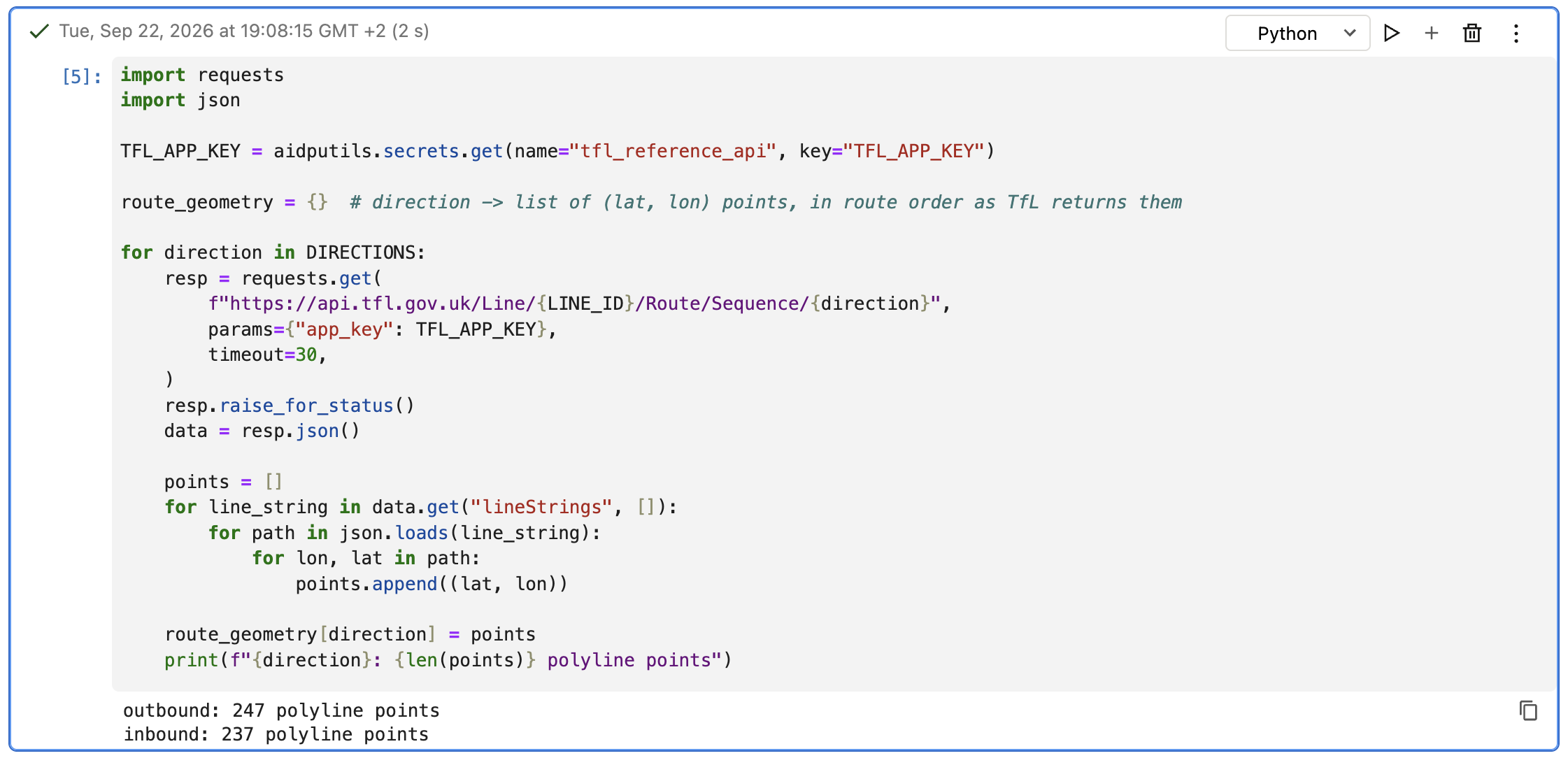
Next, each of line 25's stops is matched to its nearest point on that line, which also gives its distance from the start of the route. Sorting stops by that distance gives their order along the route, and every pair of neighbouring stops becomes a segment: the slice of road between them, with its length in metres. The segments are stored in tfl.gold.line_segments.
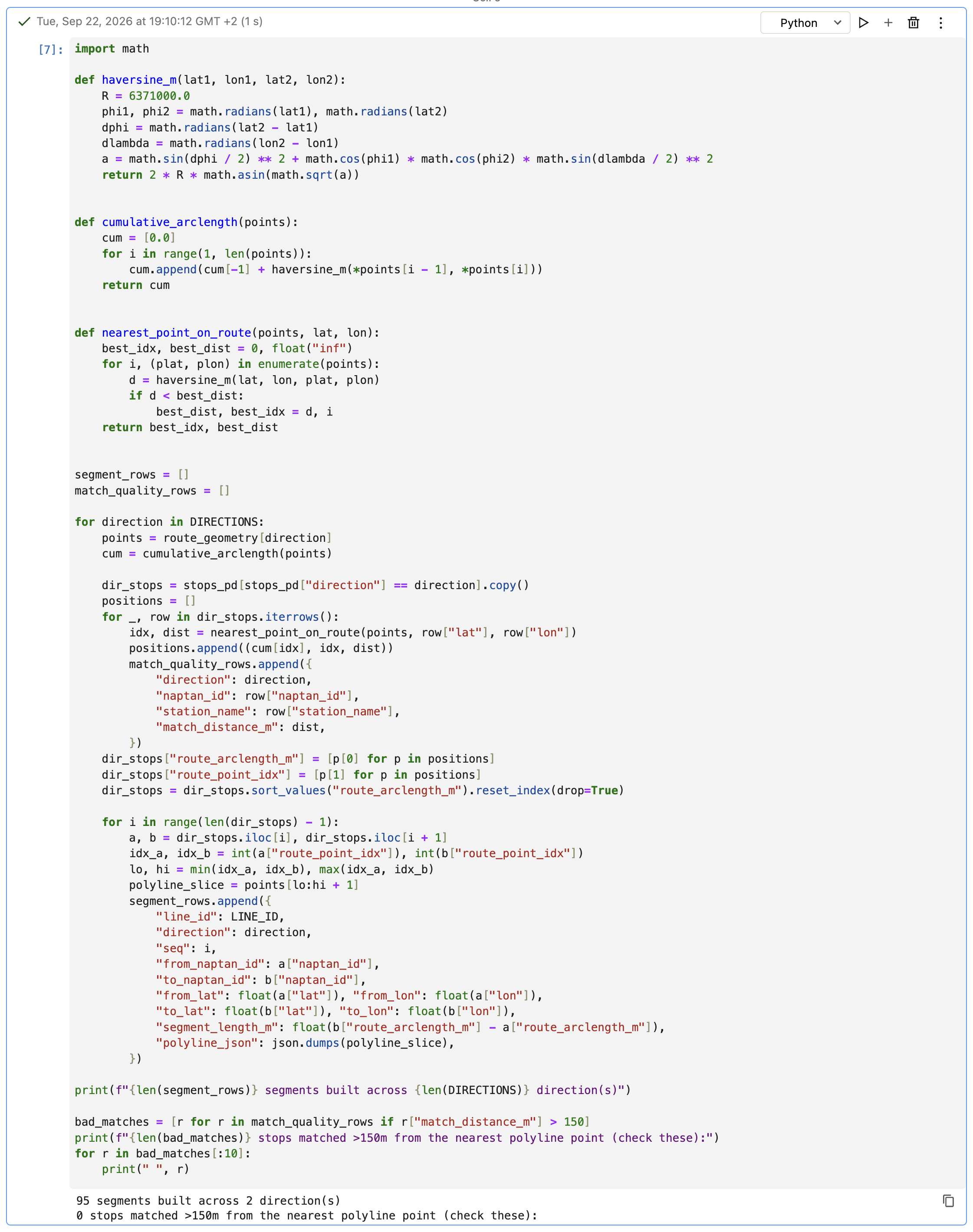
One simplification I'm aware of: each stop is matched to the nearest point on the route line, not the nearest spot anywhere along it. With TfL's points only a few tens of metres apart that's fine, but the notebook still flags any stop matched more than 150 m away, rather than trusting it blindly. For line 25 there were none.
The last step walks along a segment's road until it has covered progress of the segment's length, and that point is the bus's estimated position. If a bus's stop pair doesn't match any segment, the notebook falls back to a straight line between the two stops and flags it, rather than dropping the bus.
Three problems on the way
The design above is how it ended up. Getting there took three fixes, and each one taught me something about the data.
1. Everyone at progress 1, and rows from last week
The first run of the progress view came back with progress = 1 for every bus: every one of them apparently sitting at its next stop. Scrolling down gave the reason away, a row from September 13.
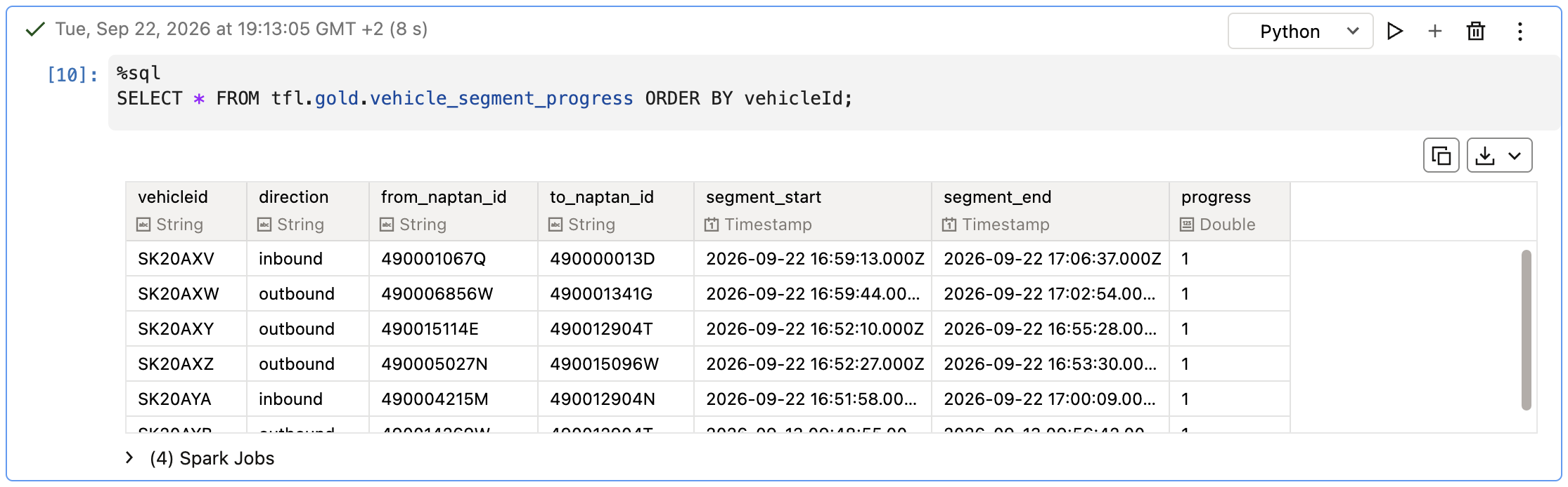
Bronze and silver had been stopped for about a week before this session. When I restarted them, they had a backlog of about 1,000 seconds to catch up on, and meanwhile silver still held rows for buses last seen before the pause. For those, "now" was days after their last expected arrival, so progress was capped at 1. Buses currently on the road were caught by the same issue until the streams caught up.
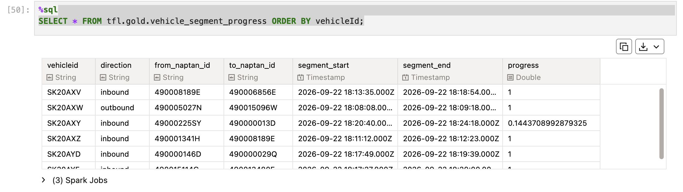
Two fixes. The real one was patience: let bronze and silver catch up to real time. The permanent one was the 30-minute filter at the end of the view: only consider buses that silver has heard about in the last half hour. After both, progress started to look like progress:
A side note on watching that catch-up. My first reflex was to check spark.streams.active from the gold notebook, which showed nothing. That's expected: every notebook is its own Spark session, even on a shared cluster, so it only sees its own streams. The place to watch another notebook's stream is the cluster's Spark UI, on the streaming query statistics page, where the input rate and processing rate charts show the backlog draining.
2. vehicleId became vehicleid
The view defines the column as vehicleId. When Python read it back through pandas, row["vehicleId"] failed: the metastore stores view column names in lowercase, whatever case the SELECT uses. You can see it in the OAC dataset from the last post too. In SQL that's invisible, because SQL isn't case-sensitive about names. Python dictionaries are. The fix is one defensive line:
vehicle_id = row.get("vehicleId", row.get("vehicleid"))
3. Two ID systems for the same stop
This was the interesting one. After the first two fixes, the interpolation still couldn't match a single bus to a segment: 0 out of 30.
The reason: for 49 of line 25's 97 stops, TfL's Route/Sequence response doesn't return the individual stop ID, it returns a stop area ID, a group that covers several stops at the same location. They're easy to recognise, they start with 490G. The live arrivals feed, on the other hand, always uses the individual stop ID. Same physical place, two different IDs, so the segments (built from Route/Sequence) and the buses (from arrivals) never matched.
The fix was to ask TfL which individual stops belong to each group. GET /StopPoint/{id} for a 490G... ID lists its children, and I built a lookup from each child back to its group:
group_ids = stops_pd.loc[stops_pd["naptan_id"].str.startswith("490G"), "naptan_id"].unique().tolist()
print(f"{len(group_ids)} StopArea-style IDs found among line 25 stops")

child_to_parent = {}
for group_id in group_ids:
    resp = requests.get(f"https://api.tfl.gov.uk/StopPoint/{group_id}",
                        params={"app_key": TFL_APP_KEY}, timeout=30)
    resp.raise_for_status()
    data = resp.json()
    children = data.get("children", [])
    for child in children:
        child_id = child.get("naptanId") or child.get("id")
        if child_id:
            child_to_parent[child_id] = group_id
    print(f"  {group_id} ({data.get('commonName')}): {len(children)} children")

print(f"{len(child_to_parent)} individual stop IDs resolved back to their group parent")

def resolve_id(naptan_id):
    return child_to_parent.get(naptan_id, naptan_id)
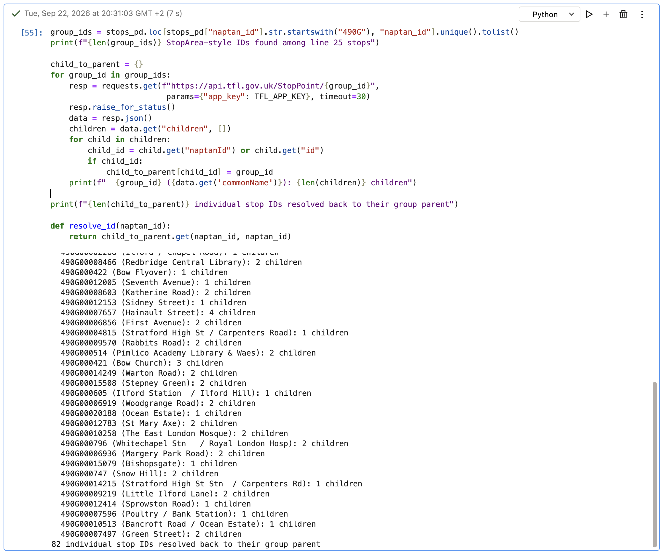
Before looking up a segment, both of a bus's stop IDs go through resolve_id, so both sides speak the same ID system.
Interestingly, this didn't show up in the stations join in Part 1. That join only asks whether each stop on the arrivals board exists somewhere in the stations table, and every one did. The mismatch only appears when a single line's route, and the order of its stops, matters.
The result
With all three fixes, the interpolation cell produced positions for 25 of the 30 buses on line 25:
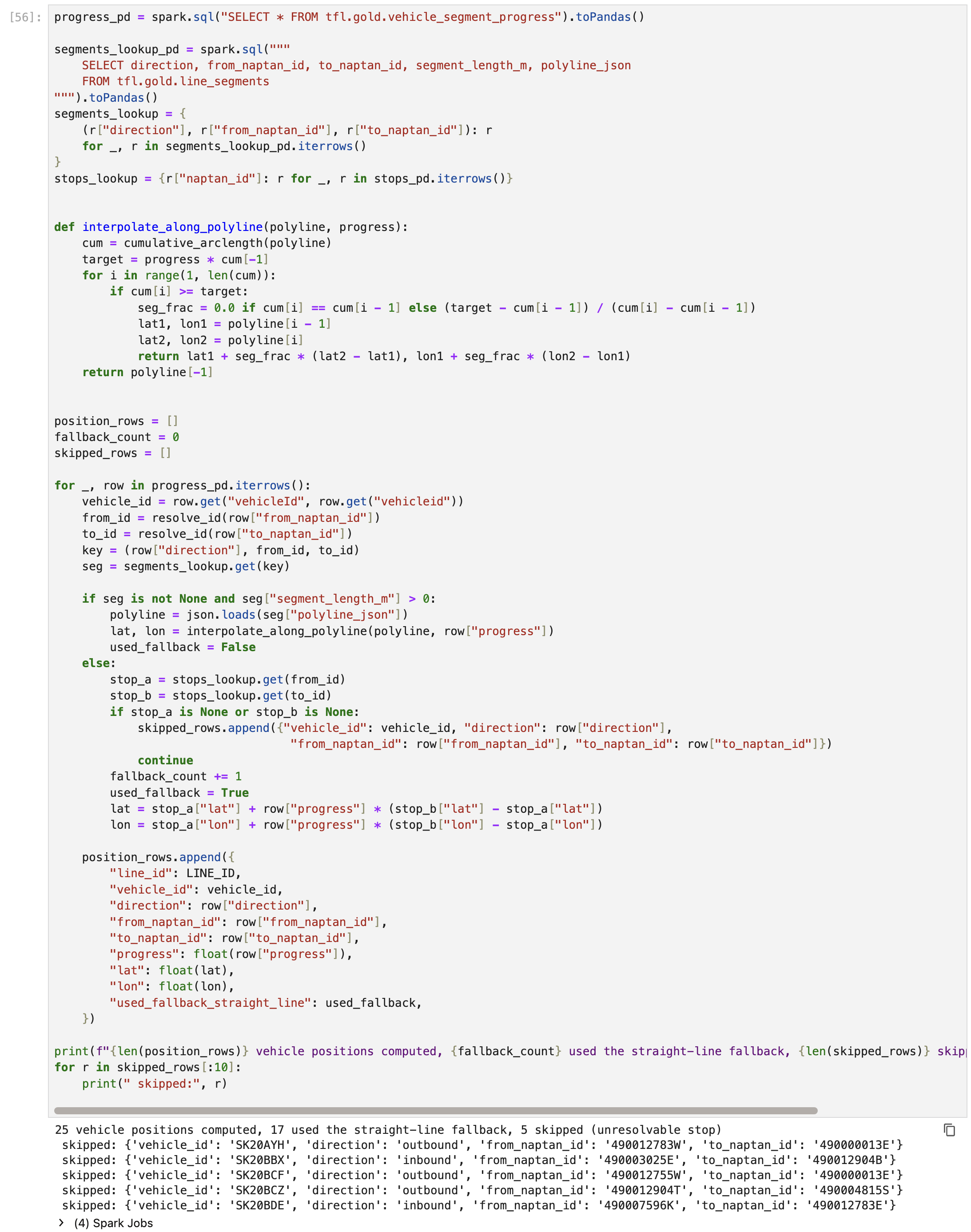
To be clear about the quality: only 8 of those 25 follow the actual road. The other 17 used the straight-line fallback, mostly on segments next to a stop area, where the group-based segments and the individual stops don't line up perfectly. Five buses were skipped because one of their stops couldn't be resolved at all, possibly a stop area nested more than one level deep. At the zoom level of a city map, straight-line positions between two neighbouring stops are close enough, so I've documented this as a known limitation rather than chasing it further for now.
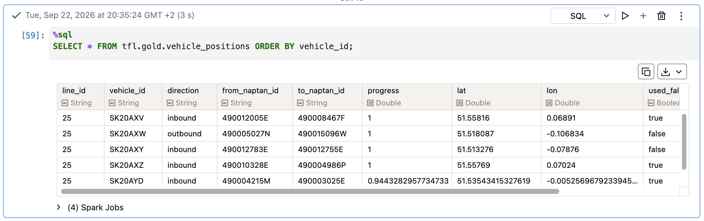
The real test is whether the buses move. I re-ran the calculation about seven minutes later and compared: 24 of the 25 buses had moved, to new segments, new coordinates, with progress advancing. A couple had even flipped direction at the end of the route, which is exactly what a bus does at a terminus. The one that hadn't moved simply hadn't received a new prediction in that window.
Running it on a clock
Re-running cells by hand proves the logic, but a map needs positions that update by themselves. The walk along the road is Python, so this can't be a view like the arrivals board. Instead, I wrapped the same calculation in the pattern I'd kept as the arrivals board's fallback: a rate stream, used purely as a clock, with foreachBatch recomputing and overwriting tfl.gold.vehicle_positions every 30 seconds.
query = (
    spark.readStream.format("rate").option("rowsPerSecond", 1).load()
    .writeStream
    .foreachBatch(refresh_vehicle_positions)
    .option("checkpointLocation", "/Volumes/tfl/gold/tfl_volume/checkpoints/vehicle-positions")
    .trigger(processingTime="30 seconds")
    .start()
)
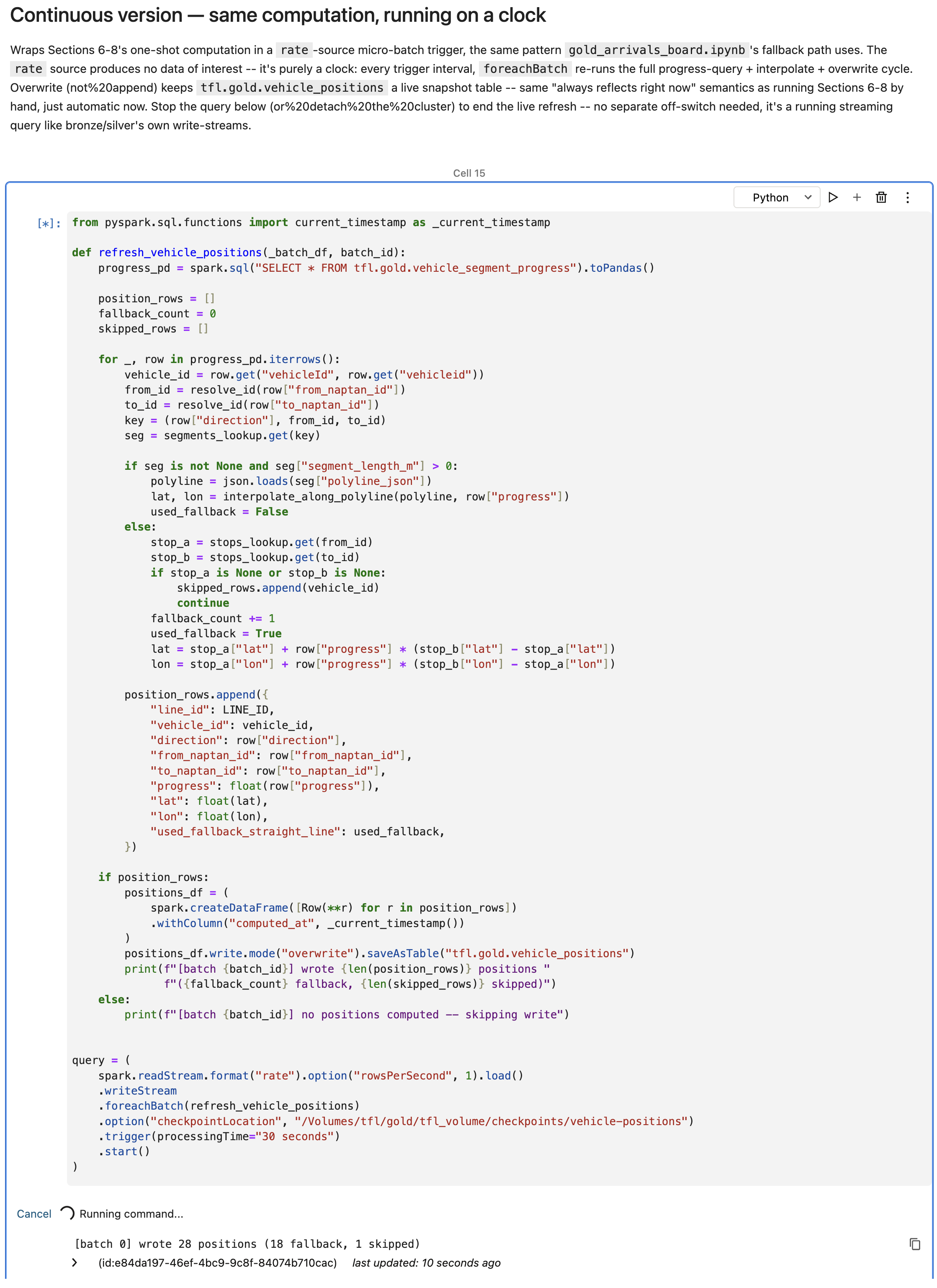
One gotcha: my first version had no checkpointLocation. It didn't fail. .start() just never returned, and the cell sat there running. Adding a checkpoint fixed it, on tfl.gold.tfl_volume, a volume I created back in stage 0 and hadn't needed until now.
Buses on the map
In OAC, vehicle_positions shows up under gold like any other table, next to stations, line_segments, and the two views.
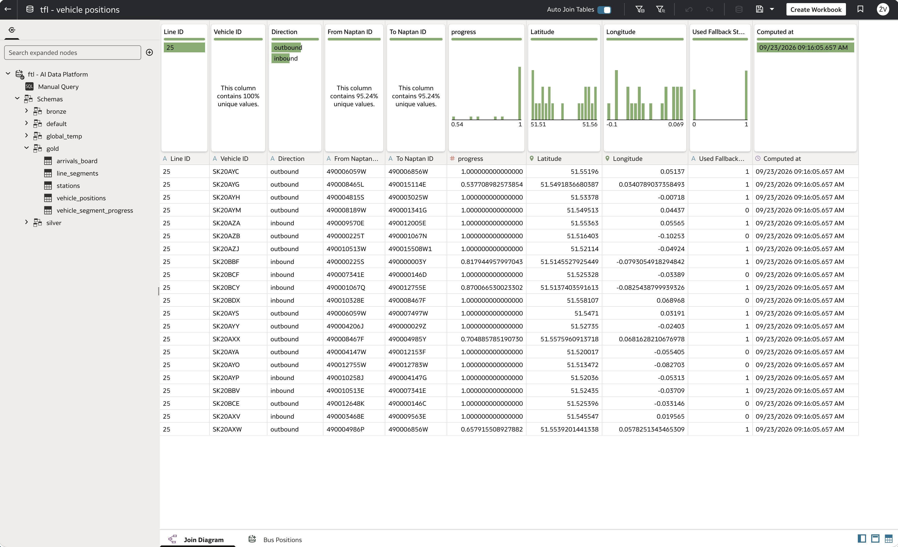
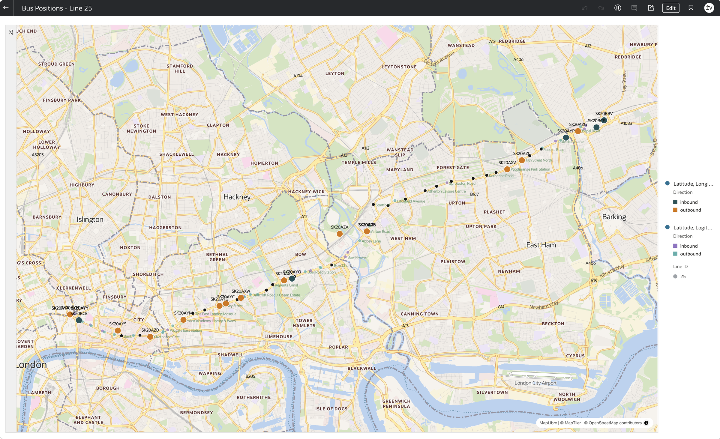
Unlike the arrivals board map, no custom map layer is needed this time. Latitude and longitude are real columns, so OAC places the buses directly. I coloured them by direction, with the vehicle ID as a label.
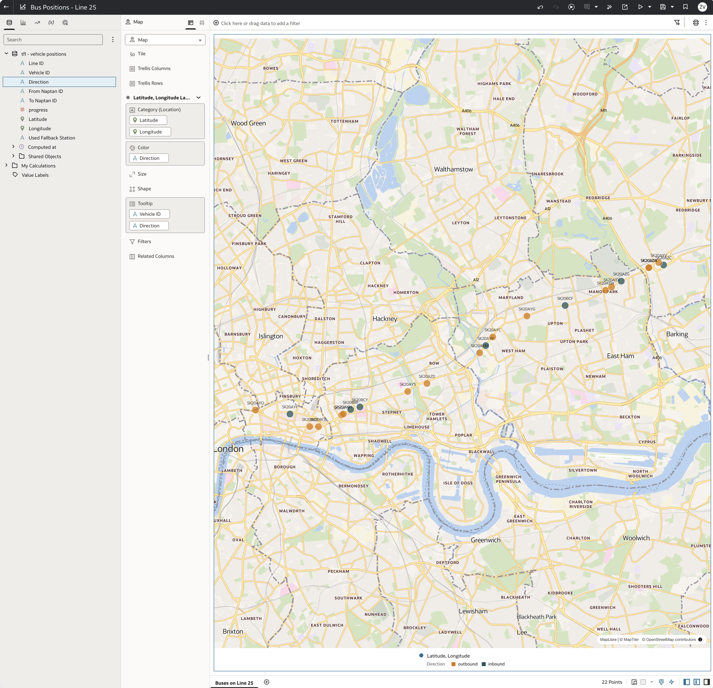
Adding a second layer from the stations table, filtered to line 25, draws the route's stops underneath the buses. That makes it easy to see that the buses really are on the route, between the stops, rather than scattered around east London.
What's next
The gold layer now has three live pieces: the arrivals board, a stations reference table covering all of London's bus stops, and live positions for line 25. All of them are queryable from OAC.
Scaling positions to every line is still open. The stop area problem and the nearest-point matching would both need another look at that scale. But for now, I want to try something different with what's already there. So far, every question I've asked this data has been SQL in a notebook or a workbook in OAC. In the next post, I'll connect Claude to Oracle Analytics Cloud through OAC's MCP server and simply ask about the live data in plain language.
Related: Just Streams: Real-Time Data Pipelines on OCI (series intro), Silver Layer: Spark Structured Streaming, Gold Layer: The Arrivals Board and Oracle Analytics Cloud